Part 5. Research Point: Stages of textile product life cycle

In this research exercise I am to briefly summarise what I think each stage of the cycle is, and then research online to see if I am right.

Textiles is completely new to me and I have no idea what the product life cycle might look like, so I hit Youtube to look for some educational videos on the topic.

Initially I watched this one;

It introduced me to lots of the vocabulary involved but didn’t really go into detail – though the information about the global impact of a t-shirt was fascinating.

I then moved onto explanatory videos more about the production of fabric. Initially I went a bit too basic and watched this one;

Whilst this video explained very well how to take fibres from wool on a sheep to a woven piece of fabric, it did not cover several of the terms listed in the course manual such as ginning.

I then used the more traditional Internet text searching to get some answers.

Agriculture/raw fiber production – I would summarise this as the process of growing cotton in fields as a crop.

Common Objective. (2019). What Are Our Clothes Made From?. [online] Available at: https://www.commonobjective.co/article/what-are-our-clothes-made-from [Accessed 10 Nov. 2019].

Ginning – I had no idea about this one so I had to go straight to the internet.

“The process of separating the cotton fibers from the cotton seeds. Perfect ginning operation would be performed if the separation of fibers from seed was effected without the slightest injury to either seeds or to the fiber. A cotton gin is a machine that quickly and easily separates the cotton fibers from the seeds, a job previously done by hand.”

Textilelearner.blogspot.com. (2019). Ginning | Cotton Ginning Process | Types of Ginning. [online] Available at: https://textilelearner.blogspot.com/2011/08/what-is-ginning-cotton-ginning-types-of_8829.html [Accessed 7 Nov. 2019].

Spinning – This one I remember from tours of sheep farms with Primary school – the process of turning (unintentional pun) original fibre whether it be cotton or wool etc into a long usable yarn on a reel. A process traditionally carried out by all family members.

Liverpoolmuseums.org.uk. (2019). From cotton to cloth – Merseyside Maritime Museum, Liverpool museums. [online] Available at: https://www.liverpoolmuseums.org.uk/maritime/exhibitions/cotton/material/cloth.aspx [Accessed 10 Nov. 2019].

Weaving – The process of transforming a yarn into a sheet of cloth. It requires two sets of yarn, the warp and the weft. Traditionally done by hand on a loom, now controlled by computer.

Processing – I would guess that this is the dying, printing and emroidering of fabric garments?

I discovered online that I wasn’t quite right. It seems that fabric, freshly woven, is known as ‘griege’ which is discoloured and full of impurities. This fabric is bleached to achieve a base colour, it is then treated with chemicals to remove oil, wax, and other naturally occurring elements from natural fibre.

Garden, H., HowStuffWorks, Garden, Decor and Techniques (2019). How is fabric created?. [online] HowStuffWorks. Available at: https://home.howstuffworks.com/home-decor/decorating-styles-techniques/how-is-fabric-created2.htm [Accessed 10 Nov. 2019].

Stitching – I would assume that this is the process of turning sheets of material into items of clothing? What springs to mind are the news stories about the India sweatshops full of people who are working for pennies per day.

What also springs to mind though, are the good news stories about people who are choosing their own path and making their own clothes…like Zack McLeod Pinset who manufactures and creates Regency clothing. In an interview he says that he does it because he feels like himself and he likes to look smart, I think that is fabulous. I’d love to make my own clothes but do not have the time, I’m saving that and learning the piano for when I finish this degree, so when I see other people successfully doing it I just want to stand up and clap! Fabulous!

Kalia, A. (2019). ‘I don’t see jeans in my future’: the people who wear complete historical dress – every day. [online] the Guardian. Available at: https://www.theguardian.com/fashion/2019/jul/04/i-dont-see-jeans-in-my-future-the-people-who-wear-complete-historical-dress-every-day [Accessed 10 Nov. 2019].

Distribution/Retail – I assume that this covers the shipping of created articles of clothing back to the UK, distribution to stores and their marketing.

Good On You. (2019). What On Earth Is A Clothing Supply Chain?. [online] Available at: https://goodonyou.eco/what-is-a-clothing-supply-chain/ [Accessed 10 Nov. 2019].

Use/Consumption and end of life – I assume this covers the average life cycle of a piece of clothing and what happens to it after it has been discarded.

This research point was eye opening. I found a government report on the economical cost of fast fashion and was aghast at some of the facts and figures. I consider myself quite well informed on matters related to saving the planet but I had absolutely no idea about the toll of clothing manufacturing on the environment.

The report is full of big hitting points but this one line made me feel physically sick “Textile production contributes more to climate change than international aviation and shipping combined”. I will never casually buy an item of clothing again!

More in relation to the point of the research exercise, I learnt that 300,000 tonnes of clothing end up in household black bins each year, less than 1% of clothing is recycled and retailers burn new unsold stock to preserve the brand. Shocking.

Publications.parliament.uk. (2019). Fixing fashion: clothing consumption and sustainability – Report Summary – Environmental Audit Committee. [online] Available at: https://publications.parliament.uk/pa/cm201719/cmselect/cmenvaud/1952/report-summary.html#heading-2 [Accessed 10 Nov. 2019].

Independent Research. Typography – In Progress

I’ve mentioned in a few exercises so far that I’d like to look further at Typography and investigate lettering of different sorts. Well, freshly inspired after watching interviews with different graphic designers and after being gently elbowed to do some research on something I enjoy by Tutor Feedback, I’ve decided to pull my finger out and have a closer look at lettering. I intend to do this through a variety of methods.

Documentarys

Helvetica. Rented from Amazon Prime

This is the first documentary about a typeface that I have ever sat through and it was actually very interesting. It was about the rise of a typeface called Helvetica and the subsequent story of how it has dominated the world of advertising text ever since. A variety of people were interviewed, some of whom loved and some of whom hate Helvetica. There was a brief explanation of the history of type faces, about how each one originally had to be carved out of metal by hand, this is something I had never properly considered before. I had known how type used to be made but had assumed that different fonts only really became a feature with the rise of computers. I was very surprised to learn how wrong that assumption was! Since watching this programme I have started to notice Helvetica font everywhere. Whilst I disagree with some of the interviewees opinions that it is the font of the Vietnam War/Capitalism, I can see why people think it is overused. It really is everywhere but that is because it is so well made and therefore useful! Main lesson learnt – Legibility is paramount.

PressPausePlay

This came up on a list of documentary films reccomended for people interested in Typography. It turned out to be nothing to do with it at all but still quite interesting. It explored how ‘the digital revolution of the last decade has unleashed creativity and the talent of people in a big way’.

It basically described how the accessibility of art forms through rapidly evolving technology has meant that everyone can now call themselves a photographer, a movie maker, a musician. The people interviewed within it were split between two camps. On the one hand there were the people who made out that we are on the edge of a cultural dark age due to the rise of the mundane artist, this level of mundane being put down to the lack of requirement to posses a high level of talent, followed by the belief that the mundane artists will overrun everything. I would disagree with this, surely if there is a wealth of mundane artists and you are an artist who has developed skill and quality, it’ll just mean that you stand out from even more people?

The other camp of people on the documentary seem to be more in favour of the evolution of the various art forms through the increase in technologies accessibility. These people were looking forward to seeing what the world looked like in ten years time to see how these fresh opportunities available to people have shaped the world of art culture.

This documentary reminded me of a couple of exercises within the course manual, most notably Part 4. Research Point. Gareth Dent – ‘Dealing with the flood’.

YouTube

YouTube is a great learning resource especially for those short on time like myself. I have found several very helpful videos introducing the topic of Typography.

In this TED talk, Mia Cinelli describes why typography is important and relates the process that she went through of turning a sample of handwritten text into a font.

In this introductory video I received a basic guide to why typography is used and how one letter form can lead to another. For example, when an ‘n’ has been designed, the design for an ‘m’ and a ‘u’ are relatively simple.

Books

As part of my investigating typography started to look at a few books. These were initially chosen because they looked to be palatable but turned out to be fascinating!

‘Why Fonts Matter – Sarah Hyndman’

This was a very user friendly introduction into different fonts, or, as I was soon re-educated ‘typefaces’. The reader undergoes several visual experiments which prove each point as it is introduced. My favourite of these was Chapter 11 which dealt with sensory experience. Whilst I had always known in a supermarket that brands try to imply value or pedigree through typefaces, I had never realised that my eating experience was also affected. One experiment inparticular deals with sweet/sour, the reader eats an item whilst looking at an angular sharp typeface, they do the same whilst looking at a rounded plumper one. The mouthful taken whilst looking at the sharp angular typeface will taste the most sour. This was incredible, I had no idea that fonts/typefaces could do this!

This made me pick up another book…

Just My Type – Simon Garfield

I initially chose this book because it looked as though it would give me more of an educational background on the history of typography, plus, it had lots of small chapters so I figured I could force my way through it if it became too dull.

No forcing required.

The tales in the history of type cannot be made up. Trying to say which bit hooked me the most is hard. Cobden-Sanderson, creator of Doves was an early contender, not content to let the type pass hands after his death he took three years to steadily throw it all in the Thames (at 76 years old) and then to make sure it stayed there, bequeathed it to the river in his Will.

Another favourite was the tale of Eric Gill, creator of Gill Sans. Disclaimer – I have quite a military (dark) sense of humour so please don’t find it too offensive when I say I found this excerpt hilarious – “Eric Gill is remembered for many things: his engravings in wood and stone, his lifelong passion for lettering, his devotion to English craftsmanship – and his typefaces, notable Gill Sans, one of the twentieth centuries earliest and classic sans serif fonts.And then there is that other thing: Gill’s scandalous and ceaseless sexual experimentation”. Page 48 Lines 1-6.

I really wasn’t expecting that in a book about typography!

The majority of the book turned out to be a thorough summary of the different notable points in the history of typography and it’s uses which I must admit has made me curious to explore old painted signs. From the sound of the book, 1920’s Paris metro signs will definetley be worth a look. It also reminded me of something else I used to find very visually appealing that I had totally forgotten about, old entertainments posters with a variety of fonts such as music hall listings or old circus style advertising.

This drove me online to do a bit of research and collect some examples. I made a Pinterest board which can be viewed here.

Looking at these posters reminded me of the themes of Time and Place from this module. I think the old posters are great, they have character, the new ones in comparison are a bit ‘arty’ for my personal taste. As I was wishing that theatre poster design could revert back to the old style, I realised exactly why they cant! Those themes and methods are so associated with a Golden Age of entertainment, music halls and dancing girls etc, that using them now would mislead people into what they were about to buy a ticket for. These are not the posters that would accompany a poetry recital or a display of contemporary dance!

Looking at this amalgamation of typefaces eventually lead me into looking at calligraphy. Calligraphy is one of those things that I would love to be really good at but haven’t yet the time to master.

Instead I picked up a book called ‘Creating Calligraphy – Inkspired’ by Betty Soldi. This is another great book which I would recommend to everybody. It’s well made, the photography inside it is stunning and the attitude of the teacher is wonderful. She constantly reassures the reader that there are no mistakes, errors are fine and the key is just to relax and enjoy. The book also contains a systematic series of letter progressions to trace, room to practice and some pages to literally just go crazy with. I’ve completed mine from cover to cover and I could cheerfully do it all again!

Pinterest Boards – Collating More Items of Interest

A board initiated by the mention of Paris Metro signs which has grown to incorporate old advertising signs in general. They’re all works of art!

A board to collect items that use multiple typefaces on the same piece. Initially started out of interest but then with a nagging feeling that this might come in handy on the next module, Graphics 1. Surely there will be a typography section in there somewhere?!

Independent Research. Gallery Visit. Wilson Art Gallery.

I recently searched my nearest proper art gallery, The Wilson, looking for any type of art that I could use to talk about Time and Place. Instead what I found was a perfect example what I think of as art and how, to me, it compares to modern day art.

Below is a fantastically detailed painting by Pierre Jean Hellmans from the 19th century. It is presented in a gorgeous gilt frame and is an absolute delight to view. It gives an immediate sense of time and place, the scene is depicted so well that I could just step through the frame and into the images itself.

Pierre Jean Hellemans ‘Moonlight Scene’about 1815-1845, Oil on Panel

In the same gallery room I found this mixed media ‘Figure by a River’. It took skill to make and still gives a sense of time and place, albeit of a different quality. However, comparing the expertly painted former image with this block painted and paper mache strewn latter sums up how I feel comparing old classic art with modern art. The older stuff, in my opinion, is better quality, more skilled, timeless and infinitely better presented. I know it’s a cliche and I know that one of the many points of this module is to introduce me to the concept that the definition of Art is now as broad and indeterminate as the edge of a sunrise, but it is just not for me. I like the old stuff a lot more!

Randomly, the art gallery also held an exhibition of furniture. I found this wooden chest very interesting. I am attracted to wooden furniture with metal twiddly bits, especially ornate ones such as this. They make me think of exotic places and exploring new lands. Looking at this metal work makes me think of adventurers travelling through jungles, or the Silk Roads or trekking to Macchu Piccu and picking tea in China. So whilst not reminding me of a specific time and place, it makes me imagine new ones very easily!

Independent Research. Gallery Visit. Castle Art, Cheltenham

I visited a local art gallery called Castle Fine Art. There is a constant stream of new art to see in this venue. A I have popped in on various occasions I have found everything from pencil drawings of Star Wars scenes to paintings by Bob Dylan.

The Rampant Jekylled Whatabanker by Peter Smith

“This sculpture is the latest addition to Peter and Jayne Smith’s Lost Impossimals series, which is inspired by history and features literary characters like Sherlock Holmes and Willy Wonka. 

An overly curious banker takes a swig of a bottle left in an old safety deposit box and turns into a giant sweet-guzzling beast in this Victorian tale. Taking London hostage, he climbs Big Ben before being injected with an antidote by a mysterious stranger – who is later unmasked as Robert Louis Stevenson, the author of The Strange Case of Dr Jekyll and Mr Hyde! “

Item description taken from https://www.castlefineart.com/art/the-rampant-jekylled-whatabanker-sculpture

I like this sculpture. It is irreverent, brightly coloured and doesn’t take itself seriously. I also like the attention to detail such as the intricate work on Big Ben. I like art like this because it is pure imagination, just escapism.

Romero Britto is a Brazilian born pop artist. His use of vibrant colours and bold shapes exude a positive happy vibe. He works hard to help engage children with arts literacy programmes and donates time and resources to more than 250 organisations.

I liked the juxtaposition of these two pieces. In the background is a piece depicting three skulls which to me, always symbolise death. Right in front of it is a sculpture of two hands touching. I believe these hands to be modeled on ‘The Creation of Adam’ by Michelangelo. I don’t know anything about ‘The Creation of Adam’ but whenever I see the painting I am reminded of life and creation. Because of this contrast, the juxtaposition of the two pieces in the gallery appeals to me.

Ronnie Wood is a classically trained artist from Ealing Art College. That was quite startling for me to learn! He varies his medium depending on what he thinks a piece requires, this can range from charcoals to oils, watercolours, spray paints, oil pastels or acrylics

One thing I still do not understand is how a famous name can command such an astounding price. Ronnie Wood can paint very well, I saw several self portraits by him on sale for approx £3000. This doodle though, this doodle commands a price tag of almost £10,000. That is a staggering amount of money and to be honest I cannot see the reason why.

A Duck Full of Joy – Tim Rogerson

Created as part of the 90th anniversary of Mickey Mouses screen debut, I also saw this cubist inspired portrait of Donald Duck by Tim Rogerson.

In 2009 he was named the official artist of Disneys D23 expo and is the official artist of the Olympic Winter Team.

I like the cubist air that Rogerson has given this portrait of Donald Duck. The colours are bright and joyous whilst the cubist approach gives an added texture to the visual dynamic.

Independent Research. Work Experience. Basic Prop Making.

I know I’m an adult, I know Harry Potter is a kids film….but it was these films that helped me realise what exactly I want to be. I love the props in the film and I love the graphic elements, what I didn’t know was which of these two elements had the strongest pull. To help narrow this down I took myself on a Basic Propmaking Skills course via a company called Creative Media Skills at Pinewood Studios.

The course was overbooked (25 students instead of 8) and dreadfully run with very little basic Health and Safety applied – I had to stop someone drilling through their own foot. Despite this, thanks entirely to the superhuman efforts of the industry Propmaster who came in on occasion to give guidance, we managed to create some articles.

Initially we were briefed to make a flat clay item that could be used to make a mould from. I chose to make a penny coin.

I’m aware of all the errors in this recreation. Aside from the intial 5 minute brief there was zero guidance or assistance provided, we were left there until 5pm to muddle along – seriously this was a dreadful waste of about £1000. But my point is, bearing in mind all the errors and circumstances, I’m happy with my penny, it’s a miracle it exists!

From that we made silicone moulds;

After this we eventually made hard plastic casts of our creations. Well we tried to, the venue initially didn’t have enough chemicals in stock to make the casts. On acquiring the chemicals they were then the wrong ones or out of date so the moulds didn’t work. Maybe I’ll try it myself in the shed at some point!

After that we moved onto making foam weapons. Made from blocks of roof insulating foam we were given a range of images to work from. I chose to make a battle axe from Warhammer.

Whilst I enjoyed making the items, the course was so badly run that I would not want to repeat it. In the future I may at times make props to amuse myself, or for exhibitions, however I would not wish to have to churn them out on an industrial scale.

I will stick to the visual imagery side of the house from now on!

Independent Research. Gallery. House of MinaLima

The House of MinaLima is a free gallery in Soho, London. Owned by the graphic design duo Miraphora Mina and Eduardo Lima (most well known for their work on the Harry Potter/Fantastic Beasts franchises) this is a small but endlessly fascinating venue to explore.

It was these films which made me realise that a) Graphic Designers are actually employed in tv/film in the first place and b) the thing which I like about fantasy films is all the ‘stuff’ that surrounds the main story line. For years I’ve tried to explain to my adult friends why I enjoy them so much, the closest I got to it was “yes the child acting is awful but look at the talking paintings and the flying cars!”. It was MinaLima which made me realise that it is the props and graphics which appeal to me.

Initially I wasn’t sure if it was more the props or the graphic elements which held the appeal. To narrow this down I took myself on a week long basic prop making course at Pinewood Studios. This is covered in a different research post. The summary is, it’s more the graphics that I want to get into (although I can now make a mean foam battleaxe if you ever have the need….).

YouTube. (2019). Behind the scenes at the House of MinaLima exhibition. [online] Available at: https://www.youtube.com/watch?v=-aroMyH5tW4 [Accessed 1 Nov. 2019].

This video from Youtube gives a basic guide to the inside of the venue for anyone that hasn’t been…

Image result for house of minalima
Jones, R. (2019). The House of Minalima – The Graphic Art Of Harry Potter.. [online] The-magician.co.uk. Available at: https://www.the-magician.co.uk/house-of-minalima.htm [Accessed 1 Nov. 2019].

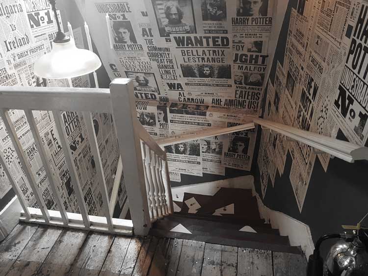
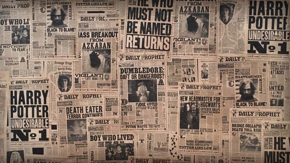
Not only is each individual piece of work highly skilled in its own right, the layout of the pieces inside the venue is visually delicious. Every surface is utilised, a trail of the famous letters lead you up the stairs whilst the stairwell itself is plastered with the ‘Wanted’ posters and ‘Daily Prophets’.

Facebook
Mentalfloss.com. (2019). The Harry Potter and <em>Fantastic Beasts</em> Easter Egg You May Have Missed. [online] Available at: http://mentalfloss.com/article/89598/harry-potter-and-fantastic-beasts-easter-egg-you-may-have-missed [Accessed 1 Nov. 2019].

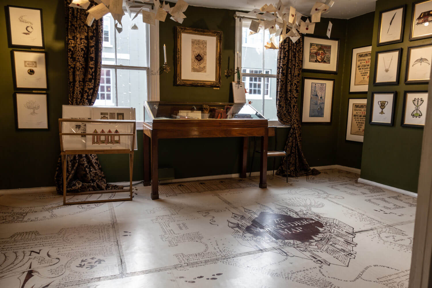
One of the things I love about their work on this franchise is that they have had to create so many different aspects. They have designed book covers, newspapers, maps, posters, packaging, logos and even props amongst so many others. One of the hero props of the series is an item called a Marauders Map which was inked entirely by hand. As someone who has attempted to create several small drawings using dip pen only to be thwarted by the rogue ink blob, this meticulously drawn perfect prop absolutely blows my noggin. In one room of the gallery it is displayed at giant size and on the floor, I mean…why not!

Image result for inside house of minalima
Pacific Northwest and Beyond. (2019). The House of MinaLima. [online] Available at: https://www.pnwbeyond.com/galleries/house-of-minalima-photos/ [Accessed 1 Nov. 2019].
Image result for the marauders map
The Noble Collection UK. (2019). Marauders Map 1,000pc Jigsaw Puzzle — The Noble Collection UK. [online] Available at: https://noblecollection.co.uk/product/marauders-map-1000pc-jigsaw-puzzle/ [Accessed 1 Nov. 2019].

Within the story there is a joke shop run by two teenage boys. When it came to designing the joke shop products packaging MinaLima say in interviews that they had to think like these characters, to design something as they would have. This piece of knowledge made me understand something I hadn’t before. I’d always looked at the packaging and assumed that the designers were having an off-day, because it’s fairly naff. Now that I understand the approach behind it, it makes a lot more sense!

Image result for weasleys wizard wheezes
Wheezes, W. (2019). Foap.com: Weasleys’ Wizard Wheezes stock photo by devoncr. [online] Foap.com. Available at: https://www.foap.com/photos/weasleys-wizard-wheezes-e0878b87-4755-435f-ae2b-a92f84370120 [Accessed 1 Nov. 2019].

Image result for weasleys wizard wheezes packaging
Pinterest. (2019). Harry Potter Weasleys’ Wizard Wheezes packaging. Each piece of the packaging has so much detail and are really beautiful. | Joke Shop in 2019 | Harry potter events, Harry potter book 2, Harry potter dolls. [online] Available at: https://www.pinterest.co.uk/pin/442900944577538367/?lp=true [Accessed 1 Nov. 2019].

Because I’m a huge MinaLima nerd I’ve watched a lot of their Youtube interviews. In one of them which I found particularly inspiring Miraphora Mina talks about how as a graphic designer you have to get really geeky about things like using the right type of paper, nerdy about fonts and typography, even about characters handwriting. The prop example which she used to illustrate this was a Paris postcard from the Fantastic Beasts films. It was reiterated again and again that authenticity in making the prop helps towards the characters getting properly into the role, how it gives them something of that era to relate too and use whilst surrounded by all the paraphernalia of a film set at work. I found this incredibly interesting to think about. Being from an engineering world, a lot of these very obvious things do not occur to me until I hear someone say them in an interview or read them in an article. These were messages which were repeated when I read articles about the work of Annie Atkins on the film The Grand Budapest Hotel. Food for thought!

Tutor Feedback Part 2. Reflection

I was very happy with my tutor feedback for Part Two.

Reading ‘The Toymakers’ again for the Assignment was an absolute pleasure so I will gladly revisit it to apply the suggestions made by my tutor.

My other main areas to work on are; primary research on something of interest which relates to the topics of time and place, and to just generally get out and looking at exhibitions more. I absolutely agree that I do not do enough primary research either online or in person. This cant be blamed entirely on my job, when I do get time at home the prospect of going out to visit a gallery often slips down my list of things to do…..after sitting on the sofa and catching up with Great British Bake Off….

One area which I would like to learn more about is Typography so I might use this as my theme to investigate.

I do have a quite easily accessible local gallery, so I do need to get myself down there more to check out the different exhibitions that travel through the town. I would also like to visit the gallery ‘House of MinaLima’ in London which is owned by the two graphic designers who worked on the Potter/Fantastic Beasts franchise. It was this duo which made me realise that graphic designers can also work in film, which I find very appealing. Reading abut their work has led me on further to artists such as Annie Atkins who worked on ‘Grand Budapest Hotel’ amongst other things.

Assignment Four. Reflection

Well isn’t La Jetee thoroughly depressing! What a miserable film. Doing this assignment reminded me strongly of studying English GCSE in school. We had to read several books, one in which a man shoots his dog and then his best friend, one in which a character spirals into negative behaviors and then they ruined Shakespeare. They could have shown us Shakepeare live as it was designed to be seen, but why do that when you could make classrooms full of people thoroughly depressed analyzing every single line of a play in which two people pointlessly (and needlessly) kill themselves!? It took me about 15 years to realise that actually, Shakespeare is really good…but anyway, I digress.

Part Four has been more enjoyable than Part One. With only one stunningly bad (for me) exercise to complete this has been a lot more tolerable than I was expecting. I have even managed to find a bright side to the hours of my life spent despairing over the fame of the work of Richard Long, telling people about it. They either think it’s mental or don’t believe me, both of which reassure me that I’m not losing the plot. I’m sure that someones response to that would probably be ‘ah so now the actual artwork itself has become verbal…your words too are art…they have transcended the physical form’…..but luckily I don’t know that person, because if I did I would have to pick up one of Richard Longs carefully placed rocks and throw it at them.

If I had been interested in studying Photography with the OCA then to be honest this part of the module would have put me off. I think that I just don’t have the ‘high art’ bit of brain that people seem to need to properly engage with it. One positive influence that I will take from it is that I will try more black and white landscapes. I found the picture in the course manual of John Davies power station to be a lot more visually striking than I initially appreciated. This was enhanced by the use of black and white as opposed to colour. When I get back to Photography again, probably after this degree, this will be something that I consider a lot more.

Assignment Four

In this assignment I am to choose one of 6 options, write a short essay that expands on my opinion of the relationship between the creative aspects of the artwork, the message the artist is trying to convey and to what extent I feel photography is a necessary part of the process.

The option that I chose was;

2. Accumulating photographs together as a way of producing a hybrid between film and stills. See La Jetee, a 1962 French science fiction short film by Chris Marker.

I used Youtube to view La Jetee and then started to read around the topic of the film to gain a broader understanding of the messages it contains. Several online articles referred to the Terry Gilliam film ’12 Monkeys’ which was inspired by La Jetee, I found it online and watched that too. I was glad I did because I think it has helped me to better understand a lot of the insinuation of Markers original.

Usually a documentary maker, Marker both broke his own trend and joined French cinemas New Wave with this new experimental method of working. I have never seen a film made entirely from stills before, during my initial viewing I was struck by how much it reminded me of a storyboard, an idea for something else as opposed to a finished product. In this sense it also reminded me of Eadweard Muybridge’s ‘Jockey on a galloping horse’, the use of still images to imply motion. This was again highlighted to me during my research in which I found it referred to as both a photo-roman (picture novel) and a cine-roman (film novel).

Initially I wondered if the use of stills as opposed to film was due to a lack of resources of the Director, as I explored the potential different messages the film contained, I came to believe that it was an intentional choice to emphasise the points that he wanted to make.

The depiction of the scientists reminded me very strongly of the Nazi bad guys in Indiana Jones films. As it was made in the 1960’s I wondered if this was a bit of a statement on fascism and control? The use of stock imagery gives a documentary feel to the film whilst the narrator ties the sequential imagery together, and gives it meaning, just as it does in a factual documentary.

 There is a recurring theme of an individual not being able to escape their present. A person can escape into memories of the past or daydream about the future, but the present is the ruling narrative of the moment. Peoples perception of the past can be altered depending on at which age and in which circumstances they review the same memory. The increase in life experiences will alter both your perception and interpretation of it. This was demonstrated in La Jetee with the recurring use of the same photo frame at different points as the story progressed but with new narrative attached. It was further repeated in 12 Monkeys in which the two characters hide in a cinematic showing of Hitchcocks Vertigo (this film is also referenced in La Jetee) and one character feels like he has seen the film before but also that it is different and new because he is older.

The message of not being able to escape the present is further reinforced by the entrapment of the male character in his circumstances. Whether it is as the character attempts to break free from the course of La Jetee’s events and accidentally fulfils them or getting physically returned to his time by the scientists, the message of ‘not escaping the present’ is relentless.

Another message that I found was around memories. Memories are a form of time travel, to recall a previous experience is to move mentally in both time and space. In a way each memory, a mental snapshot of a moment, is like a film still. A singular scene captured and open to new interpretations as the life experiences of the individual who references it evolve. Several articles that I read referred to this as the idea that when we return to the past we realise we do not understand it at all.

A slightly more depressing message that I noticed was that even when attempting to change circumstances for the better, an individual is trapped on a pathway dictated by fate. Hopefully if this is remade again, it’ll have a slightly happier overtone.

The relationship between the creative use of photographic stills and the message that the Director had is essential to the final product. If the message of the film was different to that of time and space, then there would be little to be gained from using still images in the place of motion picture. The photography is required to reinforce the idea that time is made up of individual moments, each of which can be remembered differently and need a narrative to make sense of them. Without the narrative of an individual to give context it is just a jumble of images to which many different contexts can be applied.

In this way it is reminiscent of peoples photo albums. One moment is chosen over another in which to make a recorded image of a scene or occasion. With a narrative, these choices can be explained but without that they are just a random series of recorded memories.

In conclusion, in my opinion, photography is essential to the success of La Jetee and the strong message which Chris Marker wishes to communicate. Individuals can manipulate time and space temporarily but in the end they must always return to their present. Memories are like film stills in the reel of a life, requiring context for better understanding and whilst allowing temporary escape, unable to harbour the individual from their present life.  

Word count – 888

YouTube. (2019). La Jetée (1962) [english subtitles]. [online] Available at: https://www.youtube.com/watch?v=aLfXCkFQtXw [Accessed 30 Oct. 2019].

En.wikipedia.org. (2019). La Jetée. [online] Available at: https://en.wikipedia.org/wiki/La_Jet%C3%A9e [Accessed 30 Oct. 2019].

Dillon, B. (2019). Brian Dillon on the French director Chris Marker and his enigmatic masterpiece, La Jetee. [online] the Guardian. Available at: https://www.theguardian.com/film/2009/mar/28/chris-marker-la-jetee-film [Accessed 30 Oct. 2019].

The Criterion Collection. (2019). La Jetée: Unchained Melody. [online] Available at: https://www.criterion.com/current/posts/485-la-jet-e-unchained-melody [Accessed 30 Oct. 2019].

Hinkson, J., Cameron, R., Rose, K., Rocket, S., Mikalatos, M., Rocket, S. and George, J. (2019). “There’s No Escape Out of Time”: La Jetée. [online] Tor.com. Available at: https://www.tor.com/2014/11/03/theres-no-escape-out-of-time-la-jetee/ [Accessed 30 Oct. 2019].

Palmer, L. (2019). Criterion Files #387: La Jetée. [online] Film School Rejects. Available at: https://filmschoolrejects.com/criterion-files-387-la-jet%C3%A9e-da697b989ee3/ [Accessed 30 Oct. 2019].

Anon, (2019). [online] Available at: http://m4uhd.net/watch-movie-wyta-twelve-monkeys-1995-online-free-m4ufree.html [Accessed 31 Oct. 2019].