In this exercise I am to choose a film and its corresponding poster and reflect on how the image, colour, composition and typography are used to reflect the nature of the film.
This poster for Fantastic Beasts and Where to Find Them immediately sums up the recurring theme of the film, light into darkness.
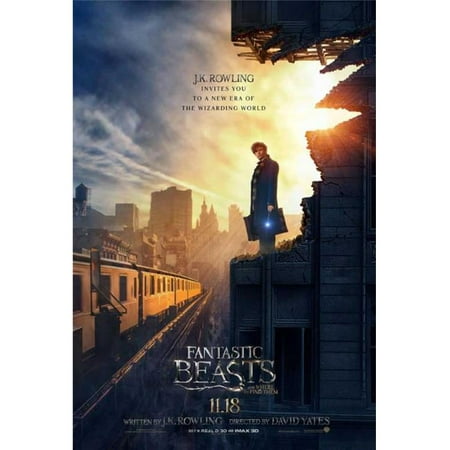
The way that the main character is positioned on the right-hand side framed by a blaze of light against the dark gloomy backdrop of new York city illustrates the characters journey through the storyline. The body language of the character communicates that he is a modest and unassuming man, a traveller as can be seen from the briefcase. The wand in his hand has a glowing tip, an echo of the brighter light behind him and potentially hinting at its source. He is well dressed yet the building he is standing on has been ravaged by either a beast (as hinted at by the film title) or events as yet unknown. The colouring of his backdrop, bules and greys, reflects the atmosphere that the character finds in the USA, his destination. Magic is strictly regulated there, paperwork for every visitors wand permit and regulations on interactions with non-magic citizens.
The character arrives in new York from the more enlightened 1920’s England, he brings with him modern thinking, new ways of doing things and new attitudes towards many aspects of life including animals. One of the themes of the film is that he is on a quest to educate fellow human beings to better understand and live alongside animals rather than being scared/attacking them.
This film poster is reminiscent of the film City of Angels in which angels are all around us, invisible but keeping an eye on events. Within the film they are usually pictured on high rise buildings in long brown greatcoats, this is what springs to mind for me when I see this poster, the character is an angel sent to help the creatures and possibly people that he finds at his destination.
The typography links directly to the Potter franchise. It has the same basic font shape and flourishes despite the nature of the letters being a lot more organic and less jagged.
