Part 3. Project 3. Crop Circle

In this exercise I am to look at the set textbook pages 80-82 and write down the signifier and the signified of such images. I am then to take note of where these phenomena are formed and their relationship to the land.

Signifier – the form a sign takes : Flattened corn in a stylised pattern

Signified – the concept to which it represents or refers : Crop circles in Wiltshire “traditionally the home of paganism and New Age mythology” refer to an unexplained relationship between the land and possibly paranormal forces.

I remember the early 90’s when mystery crop circles were all over the news. It seems a shame that artists owned up to making them and although taking the credit, also ruining the sense of mystery. This has not put people off attempting to ‘prove’ that crop circles are made by aliens, I found one BBC report (http://news.bbc.co.uk/1/hi/uk/2191565.stm ) in which a crop circle artist states that he has been told crop circle artists are part of a cover-up by the Government, even though he himself has confessed to making them in the first place.

Huge crop circle appears overnight in South West England
Earth Mystery News. (2019). Huge crop circle appears overnight in South West England. [online] Available at: http://earthmysterynews.com/2016/10/18/huge-crop-circle-appears-overnight-in-south-west-england/ [Accessed 26 Aug. 2019].

I think crop circles are class, they give people a sense of wonder and fire up imaginations in a way in which a lot of things often fail to do when you become buried in the humdrum of adult life.

They are most often found in wheat fields because wheat when bent gives the sharpest edge to enable artists to create the crispest lines. They are most often created down in South West England where tales of folk lore are the strongest. They are often located on ley-lines, or lines of energy believed to be within the land itself.

Part 3. Project 4. Film Location

In this exercise I am to examine a location and how that environment can be perceived differently.

I chose to do something a bit different for this exercise and briefly talk about Pinewood Studios Underwater Stage and Exterior Tank. (Within the Youtube video start watching from approximatley the 1.50 point)

YouTube. (2019). Pinewood Studios. [online] Available at: https://www.youtube.com/watch?v=MHQ1QfpLzvE [Accessed 26 Aug. 2019].

At 6 metres deep and containing a million litres of water, the inside water tank at Pinewood studios enables directors to create the perfect filming conditions. This facility allows production companies to save time, resources and budget allowing them to continue to make stunning imagery for almost any application.

Credits for the Underwater Stage include; Black Sea, Gravity, Great Expectations, Dark Shadows, Les Misrables, Skyfall, Captain America – The First Avenger, Johnny English Reborn, Sherlock Holmes – A Game of Shadows, X-Men- First Class, Clash of the Titans, Gullivers Travels, and Casino Royale to name a few!

CGI now ages so much and so obviously that more reliance is again placed on excellent model making. Large miniatures of vessels are built and displayed against blue screen technology allowing the sky and ocean, or in the case of Mamma Mia where entire fake villages were built, entire dwellings to be constructed and filmed as if full size. (One secret of filming I was stunned to learn whilst touring the Harry Potter experience was that in the films, when the castle of Hogwarts is seen in its entirety….its actually a model. Incredible.)

Between model makers, highly trained divers and inventive film crew, one large tank of water has contributed massively to the construction of more different recreations of time and place than one physical location ever could.

Thestudiotour.com. (2019). the studiotour.com – Productions shot at Pinewood Studios. [online] Available at: http://www.thestudiotour.com/productions.php?id=2 [Accessed 26 Aug. 2019].

Part 3. Project 4. Ex 1: The Next Big Thing

In this project I am to choose an example of contemporary visual communication and answer a series of questions on it.

The piece of visual communication that I chose is an advertising poster for Australias first organic energy drink. Stangelove’s Ginger Beer.

mcleod, l. and mcleod, l. (2019). StrangeLove Organic Energy Elixir — SOUL SOCIETY. [online] SOUL SOCIETY. Available at: https://soulsociety.com.au/soul-goods/2013/7/1/strangelove-organic-energy-drink#.XWOtFuhKiUk= [Accessed 26 Aug. 2019].
YouTube. (2019). StrangeLove Ginger Beer TVC.. [online] Available at: https://www.youtube.com/watch?v=KMWsxRuuvGo [Accessed 26 Aug. 2019].

I chose StangeLove Ginger Beer because of the advertising campaign. The cut-out nature of the static poster reminds me of the work of the Dada artists from Part 3, Project 2 Exercise 2. When I saw the poster it made me think of someone using Dada to suit a modern generation. This made me curious about whether the company were intentionally referencing an earlier era or if it was a coincidence. This was cleared up for me the moment that I watched the YouTube TV advertisement for the same product. Using the tagline ‘the recipe we stole from old people’ makes it quite clear that they want to reference the older eras and make them relevant for the now.

What charaterises it as ‘new’? How does it fit within wider contemporary trends?

I characterise this poster as ‘new’ because of the use of colors and content. Everything on the poster is designed to make the bottle the star of the image. The colour palette complements the yellow of the liquid whilst the montage of classic art cut out images complements the bottle as opposed to distracting from it. The subject matter of plants and fruits and bees etc reflects the organic elements of the bottles ingredients. The choice to include human elements is a little harder for me to explain other than of adding aesthetic interest? The sprawled man at the bottom left hand side of the bottle and the pose of his arm draws the eye along the tag line at the bottom of the compilation. A human eye immediately draws attention from the viewer as it is a natural reaction to look at someones eyes to make a connection. The only eye available for the viewer to connect with is on the label of the bottle which makes sense. So, to answer the question a little more clearly, for me it is the chosen style of presentation of the historic items contained within the poster which make it new.

Are there any direct lines of influence from other contemporary artifacts – or historical ones?

This poster is very reminiscent of Dada art. Dada was satirical and often nonsensical whilst spreading messages on themes of anti-war. The use of pieces of classical art in juxtaposition to each other to enhance the presentation of the product reminds me of their style very strongly.

What factors will lead to your example becoming last years thing? What aspect of the design will age first? What do you think will replace it?

Advertising styles much like fashion often seem to go in cycles. I believe that the element that will lead to it aging first will be the choice of collage as a medium. I think we are due for more use of classical art paintings within advertising, we have recently peaked with the use of highly detailed photographic images and stylised futuristic shots. Despite this there seems to be a growing swell of peoples awareness of the planet, what they are eating and where resources actually come from. People are making lifestyle choices to help the planet not just for material gain. I think the pendulum will swing the other way from photographic images and we will continue to see more of classical art imagery or Photoshop originated fantasy gain prominence in advertising campaigns.

Part 3. Project 3. Ex 2: Join the Navy

In this exercise I am to look carefully at a provided image (Navy recruitment poster) and describe its literal elements. I am then to think about its implied meaning.

The poster depicts a Navy sailor straddling a giant golden torpedo in the manner of a bucking bronco. There is accompanying text ‘Join the Navy – the service for fighting men’. The sailor is in a position of exuberance, he is successfully riding the torpedo but has one arm cast jubilantly into the air.

At the time the poster was created, which I would guess to be approximately the 1920’s (from the style of the uniform) the messages of the poster would be a lot different from what they would be if such a poster were to be released this year. At the time the message of the poster would be concentrating on reinforcing the fact that the Navy were the best of the three services, that the manliest men would join the Navy to truly fight the enemy. This is signified by the sailor so skillfully riding the torpedo. The emphasis for the artist at the time would have been on depicting the sailor as a fighting man, a warrior.

If the same poster were released this year the first thought that would spring into a lot of peoples minds (mine included – so ashamed) is that they had depicted the sailor riding a massive phallic symbol. The message would still be the same, that they wanted to show the Navy men as the ultimate manly men, the only difference is the shift in cultural emphasis. Sex seems to be used in advertising a lot more now, we’re surrounded by it, so unfortunately, its one of the first things that springs to mind.

Army recruitment poster comp
Forces Network. (2019). ‘Your Army Needs You’: Army Unveils Latest Recruitment Campaign. [online] Available at: https://www.forces.net/news/your-army-needs-you-army-unveils-latest-recruitment-campaign [Accessed 26 Aug. 2019].

Above are the latest attempts by the modern day Army to lure in recruits through its doors. What the recruitment company has attempted to focus on are the reasons why people think that they are not suitable for the army and to quash them. They have used the juxtapositioning of something detrimental like “Phone Zombies” next to an image of someone smartly dressed in uniform to create an interest for the viewer. The range of posters were intentionally created in a style reminiscent of the iconic Kitchener recruitment poster. These new images have had a mixed response. I for example, can see what angle they were attempting to work with, I can see what message the poster designers were trying to put across. A lot of people have been immediately getting offended by being labelled a ‘phone zombie’ or a ‘snowflake’ or a ‘me meme millennial’ and miss the point completely.

Part 3. Project 3. Ex 1: What does this apple mean?

For this exercise I am to use images of apples as a starting point. I am to think about what the image of an apple could represent or signify, placing recognisable images in contrast to others in order to generate new meanings  or to reveal critique or satirise exisiting images and the ideas represented in those images in some way.

Magritte TheSonOfMan.jpg
 En.wikipedia.org. (2019). The Son of Man. [online] Available at: https://en.wikipedia.org/wiki/The_Son_of_Man [Accessed 19 Aug. 2019].

In this image by Rene Magritte ‘The Son of Man’ the apple is being used as a form of disguise. Magritte is supposed to have said about this painting “… It’s something that happens constantly. Everything we see hides another thing, we always want to see what is hidden by what we see.” In this context the apple is being used to hide the face of the man and to make the viewer curious about what it is concealing.

What does this apple mean? Disguise

An Apple-gathering by Frederick Morgan - Reproduction Oil Painting
1st-art-gallery.com. (2019). An Apple-gathering Painting by Frederick Morgan Reproduction | 1st Art Gallery. [online] Available at: https://www.1st-art-gallery.com/Frederick-Morgan/An-Apple-Gathering.html [Accessed 19 Aug. 2019].

In this image the apples are being used as a complimentary item of a summer scene. Collecting apples in the orchard is something which is quintessentially English, it evokes images of summer days and English summers in green fields with blue skies. In this image apples are a decorative addition.

What does this apple mean? Summer

Image result for apple religious art
Limited, A. (2019). Stock Photo – “fine arts, religious art, Adam and Eve, “Eve with apple under the tree”, glass painting, detail, Zürich master, first half 16. [online] Alamy. Available at: https://www.alamy.com/stock-photo-fine-arts-religious-art-adam-and-eve-eve-with-apple-under-the-tree-10879680.html [Accessed 19 Aug. 2019].

This stained glass window depicts the apple in the most traditional context used by art. Eve eating the apple from the forbidden tree in the Garden of Eden and so causing herself and Adam to be cast out is an image of temptation which is still used heavily today.

What does this apple mean? Temptation

Image result for apple iconic
Cookson, G. (2019). The story behind Apple’s iconic logo – Hotfoot Design. [online] Specialist Web Design and Brand Agency in Lancaster, Lancashire | Hotfoot Design. Available at: https://www.hotfootdesign.co.uk/white-space/apple-iconic-logo/ [Accessed 26 Aug. 2019].

This image of the apple is used by technology giant Apple. It is on every piece of technology they produce and has become so widely recognised that no text addition is required to make it recognisable as what it is. There are urban myths that the bite out of the apple was added in as a nod to Alan Turing who was a famous code breaker during World War Two who worked at Bletchley Park. Persecuted for being homosexual he died eating an apple infused with cyanide at the age of 41. Interestingly the article which I found this image on states that the designer actually added the bite out of the apple to stop it from looking like any other round fruit.

What does this apple mean? Technology

Image result for apple in advertising
Adsoftheworld.com. (2019). Medical Mutual Print Advert By Wyse: Apple | Ads of the World™. [online] Available at: https://www.adsoftheworld.com/media/print/medical_mutual_apple [Accessed 26 Aug. 2019].

This image of an apple is being used to reinforce the impression of health and wellbeing. This company is attempting to promote the angle that it a health insurer of a baseball team called the Indians. Using an apple, the subject of such phrases as “an apple a day keeps the doctor away” instantly creates the desired association in the eyes of the viewer.

What does this apple mean? Health

Part 3. Project 2. Ex 3: Film Posters

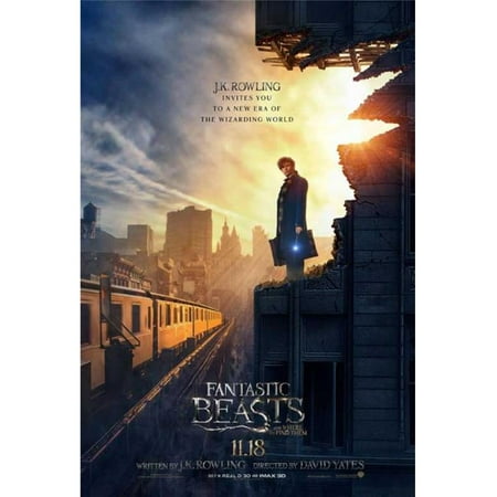
In this exercise I am to choose a film and its corresponding poster and reflect on how the image, colour, composition and typography are used to reflect the nature of the film.

This alt value should not be empty if you assign primary image
Walmart.com. (2019). Pop Culture Graphics MOVCB41845 Fantastic Beasts & Where to Find Them Movie Poster, 11 x 17 – Walmart.com. [online] Available at: https://www.walmart.com/ip/Fantastic-Beasts-and-Where-to-Find-Them-Movie-Poster-11-x-17/103055342 [Accessed 26 Aug. 2019].

This poster for Fantastic Beasts and Where to Find Them immediately sums up the recurring theme of the film, light into darkness. 

The way that the main character is positioned on the right-hand side framed by a blaze of light against the dark gloomy backdrop of new York city illustrates the characters journey through the storyline. The body language of the character communicates that he is a modest and unassuming man, a traveller as can be seen from the briefcase. The wand in his hand has a glowing tip, an echo of the brighter light behind him and potentially hinting at its source. He is well dressed yet the building he is standing on has been ravaged by either a beast (as hinted at by the film title) or events as yet unknown. The colouring of his backdrop, bules and greys, reflects the atmosphere that the character finds in the USA, his destination. Magic is strictly regulated there, paperwork for every visitors wand permit and regulations on interactions with non-magic citizens.

The character arrives in new York from the more enlightened 1920’s England, he brings with him modern thinking, new ways of doing things and new attitudes towards many aspects of life including animals. One of the themes of the film is that he is on a quest to educate fellow human beings to better understand and live alongside animals rather than being scared/attacking them.

This film poster is reminiscent of the film City of Angels in which angels are all around us, invisible but keeping an eye on events. Within the film they are usually pictured on high rise buildings in long brown greatcoats, this is what springs to mind for me when I see this poster, the character is an angel sent to help the creatures and possibly people that he  finds at his destination. 

The typography links directly to the Potter franchise. It has the same basic font shape and flourishes despite the nature of the letters being a lot more organic and less jagged.

Part 3. Project 3. Ex 2: Contextualising Images

In this exercise I am to research a selection of artists mentioned and then using a current news item, re-contextualise an images to say something new about the story it represents.

John Heartfield

famous anti-fascist images ww2 heartfield aiz nazi germany
John Heartfield Exhibition. (2019). Anti-Fascist Art. Heartfield’s Famous Anti-Nazi Antiwar Anti-Fascist Images. Warnings Of The Rise Of Fascism. [online] Available at: https://www.johnheartfield.com/John-Heartfield-Exhibition/john-heartfield-art/famous-anti-fascist-art/heartfield-posters-aiz [Accessed 8 Aug. 2019].

John Heartfield was an artist who managed to earn himself the 5th spot on the Gestapos most wanted list, pretty impressive work. Between 1930 and 1938 he created artwork for popular left wing magasine Arbeiter-Illustrierte-Zeitung (AIZ). It took until 1933 for him to leave Berlin after an SS assassination squad broke down the door to his apartment and he narrowly escaped.

I found a variety of covers for the AIZ magasine online, this is my particular favorite as the message is so clear. The dove of peace impaled upon the bayonet of war needs no further explaining!

Peter Kennard

Peter Kennard. (2019). Photomontage. [online] Available at: http://www.peterkennard.com/photomontage#/earth/ [Accessed 10 Aug. 2019].

Peter Kennard is a photomontage artist who is most well known for his political works made for CND in the 70’s and 80’s. Trained as a painter originally he abandoned it in favour of montage in the 70’s in a bid to better unite art and politics for a wider audience.

I chose this image because although simple it has a few definite points to make. I think that it is illustrating the absurdity of human having filled the Earths orbit with lethal missiles pointing down at our own planet. Some are meant to strike at an enemy, some are meant to shoot down an enemies missiles, but all of them are designed for the same thing, death. Humans are killing each other but worse, the very planet that we are stood on with our ignorance and greed.

Hannah Hoch

Hannah Hoch was a German Dada artist who was one of the original photomontage artists.

Dada definition= ”  the Dada movement consisted of artists who rejected the logicreason, and aestheticism of modern capitalist society, instead expressing nonsenseirrationality, and anti-bourgeois protest in their works.[4][5][6] The art of the movement spanned visual, literary, and sound media, including collagesound poetrycut-up writing, and sculpture. Dadaist artists expressed their discontent with violence, war, and nationalism, and maintained political affinities with the radical far-left” En.wikipedia.org. (2019). 

Dada. [online] Available at: https://en.wikipedia.org/wiki/Dada [Accessed 10 Aug. 2019].

Hoch survived the Third Reich despite being classed as a degenerate artist where many of her works linked the liberation of women with political revolution.

Cut with the Kitchen Knife Dada through the Last Weimar Beer-Belly Cultural Epoch in Germany (1919) was a famous piece that is seen as a criticism of the democracy imposed by the Weimar Repulic.

Im still not sure how this can be seen as a criticism of the Weimar democracy? Maybe its the juxtaposition of the word Dada with the different elements Hoch has chosen to represent?

Martha Rosler

Much like Hannah Hoch, Martha Rosler focuses a lot of her work on the position of females within a male dominated society.

Blog.nmwa.org. (2019). Martha Rosler | Broad Strokes: The National Museum of Women in the Arts’ Blog. [online] Available at: https://blog.nmwa.org/tag/martha-rosler/ [Accessed 10 Aug. 2019].

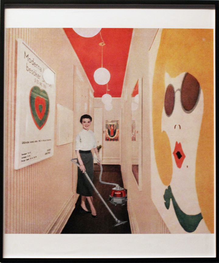
Born in America in the 40’s Rosler had a different view of women within a male dominated society from Hoch but still reaches approximatley the same message. The woman shown in the above image ‘ Woman with Vacuum, or Vacuuming Pop Art‘ shows a woman in a domestic setting. She is surrounded by images by male pop artists and is pictured in a subservient role. It reminds me of an essay I had to write years ago about the film Oceans 11, at one point in the film Julia Roberts is shown wearing a stunning dress alone in an art gallery. The point of that particular camera shot was to show that she is considered by the male character as just another possession, another piece of his collection. I receive the same message from this image by Rosler. The woman with the vacuum is far prettier than anything on the walls, far more useful, yet she is relegated to cleaning the area. The area which I notice is small and cramped and looks to be trapping her inside. But then again that small corridor could be seen as an attempt to frame the female character and present her as the greatest work of art of them all, everything is very open to interpretation.

Tate. (2019). Martha Rosler | Tate. [online] Available at: https://www.tate.org.uk/whats-on/tate-modern/exhibition/ey-exhibition-world-goes-pop/artist-biography/martha-rosler [Accessed 10 Aug. 2019].

In the second part of ths exercise I had to ” using a current news item, re-contextualise an images to say something new about the story it represents

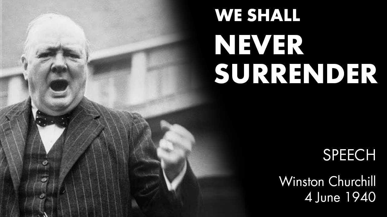
I chose to use Boris Johnson because I think that he’s a fabulous character. Of all the issues he’s thrown himself into lately I chose to use the Brexit deadline. When he gets going he really reminds me of Winston Churchill and his anti-Nazi rhetoric. I used a selection of photographs to put my montage together.

Flags of the United Kingdom and the European Union. UK Flag and EU Flag. British Union Jack flag. Stock Photo - 57550566
123RF. (2019). Flags of the United Kingdom and the European Union. UK Flag and... [online] Available at: https://www.123rf.com/photo_57550566_flags-of-the-united-kingdom-and-the-european-union-uk-flag-and-eu-flag-british-union-jack-flag-.html [Accessed 10 Aug. 2019].
YouTube. (2019). WE SHALL NEVER SURRENDER speech by Winston Churchill (We Shall Fight on the Beaches). [online] Available at: https://www.youtube.com/watch?v=s_LncVnecLA [Accessed 10 Aug. 2019].
Nationalreview.com. (2019). Boris Johnson & Prime Minister Candidates: Can Anyone Beat Him? | National Review. [online] Available at: https://www.nationalreview.com/2019/07/can-anyone-beat-boris/ [Accessed 10 Aug. 2019].

I kept the message quite simple, I wanted to just communicate Johnson’s Churchillian determination to stand up for the independence of the UK against the oppressive EU overlords. I think this image does that quite successfully.

Part 3. Ex 1: Identifying Visual Communications

In this exercise I am to identify two or three different examples of 6 types of visual communication; alternative messages, interactive design, authorial content, identity design. information and persuasion. I am then to make notes on the ways these visual images make reference to broader ideas of visual culture.

Persuasion

  1. Poster Advertising – Health and Habits

In this advertisement the NHS, a very overstretched organisation, are making a simple point. If you smoke then you are killing your heart, the organ that keeps you alive. The visual image of the heart in the ash tray should be enough to make any smoker think twice and look at the information line about how to find ways to stop smoking. Society is becoming increasingly visual, it is a far more effective approach to show someone a photographic representation of what they are doing to themselves. Intellectually every smoker knows that their habit is unhealthy so taking the same text based approach will not have any new great effect.

2. Moving Image advertising – Quality of Fast Food

YouTube. (2019). The Whole Chicken. [online] Available at: https://www.youtube.com/watch?v=KykM1kwdaOA [Accessed 8 Aug. 2019].

This advertisement has used humor (I for one can’t watch it without laughing) to inform viewers that the product used by KFC is ‘The Whole Chicken’. I was torn about whether to use this as an example of Persuasion or Information, I chose to class it as Persuasion because KFC ‘s end goal is to persuade us to become customers.

Using humour and a popular music soundtrack makes it accessible to a wide range of ages, inparticular their target audience of young people.

3. Political Slogans

Leave bus
Newstatesman.com. (2019). It’s official – there’s a £200m hole in the Brexit bus NHS promise. [online] Available at: https://www.newstatesman.com/politics/staggers/2017/08/its-official-theres-200m-hole-brexit-bus-nhs-promise [Accessed 8 Aug. 2019].

This Brexit Bus was used as a campaigning tool during the run up to the EU Independence referendum. Slogans such as this are designed to play on the emotions of those who see it and stimulate an emotional response.

Information

  1. Furniture Assembly Instructions
hard ikea furniture manual
Mates, F. (2019). 6 Hardest IKEA Furniture to Assemble. [online] Flat Pack Mates. Available at: https://flatpackmates.co.uk/blog/hardest-ikea-furniture-to-assemble/ [Accessed 8 Aug. 2019].

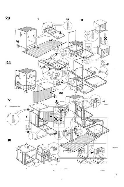
This is an example of the instructional diagrams that come with furniture flat-packs. Using a picture guide ensures that language is not a barrier, this will aid the company in terms of global marketing. Picture guides are also easy to interpret and follow.

2. Aircraft Safety Instructions

No luggage.jpg
Maksel, R. (2019). Those Safety Instructions in Your Airplane Seat Pocket? Nobody Understands Them.. [online] Air & Space Magazine. Available at: https://www.airspacemag.com/daily-planet/cards-180950298/ [Accessed 8 Aug. 2019].

Aircraft safety instructions are given in pictograph form to enable greater comprehension by passengers. I would assume that this is to meet the challenge faced by different language and education levels. Interestingly my research flagged up an article which showed that they had to be redesigned by non-cabin safety experts as passengers intiially struggled to comprehend the finer detail.

3. Visual Map

museum_map.jpg
Faculty.oc.edu. (2019). Map of British Museum. [online] Available at: http://faculty.oc.edu/stafford.north/britmus/mapanim.htm [Accessed 8 Aug. 2019].

This is an example of the kind of map regularly displayed at public attractions. Its simple pictorial form allows people to navigate around various facilities. The use of colour makes it simple to identify a specific theme such as rooms displaying exhibits relevant to ‘Egypt’.

Identity Design

  1. Liverpool Victoria Insurance
MyCustomer. (2019). Customer experience: The LV= approach to ‘Why On Earth’ moments. [online] Available at: https://www.mycustomer.com/experience/engagement/customer-experience-the-lv-approach-to-why-on-earth-moments [Accessed 8 Aug. 2019].

LV= are an insurance company who have a reputation for excellent customer service. Their logo is purposely designed to resemble the word ‘love’, this is the message which they wish to give their customers. In a marketplace where everyone seems to just be out to take as much of your money as possible, LV= are giving out a message that they will care about their customers, treat them with respect and heart.

2. Apple

Apple (United Kingdom). (2019). Apple (United Kingdom). [online] Available at: https://www.apple.com/uk/?afid=p238%7CsaOVFdZd6-dc_mtid_187079nc38483_pcrid_352745420825_pgrid_15144742573_&cid=aos-uk-kwgo-brand–slid–bran-apple-e-product- [Accessed 8 Aug. 2019].

Apple, a technological giant with instant global recognition. Rumours say that the bite missing from the apple is a nod to Alan Turing during the code breaking era at Bletchley Park. The logo is simple, dynamic and instantly recognizable. Taken as a guarantee of quality it adorns everything from mobile phones to laptops and tablets.

3. Royal Air Force

En.wikipedia.org. (2019). Royal Air Force roundels. [online] Available at: https://en.wikipedia.org/wiki/Royal_Air_Force_roundels [Accessed 8 Aug. 2019].

The RAF uses an iconic roundel design as it’s logo. Reminiscent of a target and incredibly simple this roundel gets applied to everything from clothing to aircraft and is instantly recognisable. Historically a roundel was used to identify planes a British and more easily discernible from the Germans. Originally the Union Jack was painted on aircraft but this was often mistaken for the Iron Cross (German). In 1914 it was decided that the RAF would imitate the French with the use of a roundel but reverse the colour scheme. This logo is still in use today.

Authorial Content

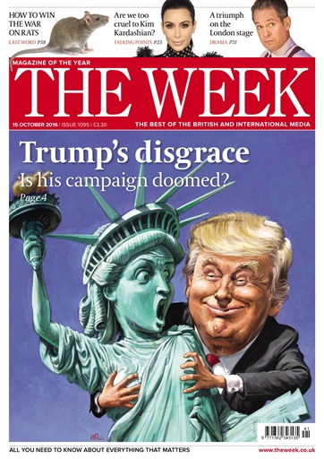
  1. The Week Magasine
Pocketmags.com. (2019). The Week – 15th October 2016. [online] Available at: https://pocketmags.com/ca/the-week-magazine/1095 [Accessed 8 Aug. 2019].

The illustrations on the front of the magasine The Week always relate to the news stories on the inside. Uniquely they uses a combination of humour and excellent traditional painting of caricatures to render a unique cover image. Such an approach to cover design ensures that they stand out on the shelves of newsagents and make an impression.

2. Graphic Novel

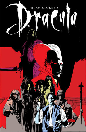
Bram Stoker's Dracula (Graphic Novel) by
PenguinRandomhouse.com. (2019). Bram Stoker’s Dracula (Graphic Novel) | PenguinRandomHouse.com: Books. [online] Available at: https://www.penguinrandomhouse.com/books/579782/bram-stokers-dracula-graphic-novel-by-roy-thomas-mike-mignola/9781684053155/ [Accessed 8 Aug. 2019].

The covers of graphic novels always give an indication of the story within. Even without previously knowing Bram Stokers ‘Dracula’ we can make some guesses as to the theme of the story from the visual elements on the cover. The themes of black and red lead us towards the horror genre which is reinforced by the religious iconography and the body language of those depicted in this cover montage.

Interactive Design

  1. Bandersnatch – Netflix TV series
Image result for bandersnatch tv series
YouTube. (2019). Black Mirror: Bandersnatch | Official Trailer [HD] | Netflix. [online] Available at: https://www.youtube.com/watch?v=XM0xWpBYlNM [Accessed 8 Aug. 2019].

Massive in pop culture the Bandersnatch choose-your-own-adventure went viral in the winter of 2018. The first of it’s kind this episode of series Black Mirror allowed viewers to partake via their remote controls in choosing their way through the episodes plotline with 5 different endings. It gained a lot of publicity for it’s innovation and for the series it originated from.

2. Computer Games

Image result for a thiefs end
Jones, G. (2019). Uncharted 4: A Thief’s End – More waiting for PS4 fans revealed. [online] Express.co.uk. Available at: https://www.express.co.uk/entertainment/gaming/629130/Uncharted-4-A-Thief-s-End-release-date-April-PS4 [Accessed 8 Aug. 2019].

Computer games are what springs to mind the most in terms of interactive design. Adventures allowing the player to explore a variety of paths to progress along a pre-established game pathway are constantly popular. The choice to kill an established villan or not, where to hide the body, how to infiltrate a building, everything is open to the game player.

Alternative Messages

  1. Fathers for Justice
Richardson, A. (2019). ‘Church Stretton was such a hotbed’: How Fathers 4 Justice started in sleepy Shropshire. [online] Shropshirestar.com. Available at: https://www.shropshirestar.com/news/2018/01/15/church-stretton-was-such-a-hotbed-how-fathers-4-justice-started-in-sleepy-shropshire/ [Accessed 8 Aug. 2019].

Fathers for Justice are a group of Fathers banned from seeing their children in search of equal rights and access to their offspring. They carry out publicity campaigns such as storming Parliament or gatecrashing Buckingham Palace to raise public awareness.

2. Immigration protests

Bored Panda. (2019). 89 Of The Funniest Protest Signs Ever. [online] Available at: https://www.boredpanda.com/funny-protest-signs/?utm_source=google&utm_medium=organic&utm_campaign=organic [Accessed 8 Aug. 2019].

Alternative placards such as this are becoming more and more popular on mass protests. Other favourites include ‘I dont know why we’re shouting’ and ‘Someone told me there would be cake’. Intended as they are to be humorous, they also have a serious point to make.

Assignment Two

In this assignment I am to choose a piece of text by a contemporary author that explores time and/or place. I am then to carry out a close reading of it and write about my response, interpretation and feelings about the writing and its themes. I am also to mention: plot, structure, character, narrator, point of view, language and language techniques, as well as possible themes of time and place. (Word limit – 1500)

The Toymakers by Robert Dinsdale. Chapter 1 Page 1

The Emporium opens with the first frost of winter. It is the same every year. Across the city, when children wake to see ferns of white stretched across their windows, or walk to school to hear ice crackling underfoot, the whispers begin: the Emporium is open! Christmas is coming, and the goose is getting fat … If, at a certain hour on a certain winter night, you too had been wandering the warren between New Bond Street and Avery Row, you might have seen it for yourself. One moment there would be darkness, only the silence of shops shuttered up and closed for business. The next, the rippling snowflakes would part to reveal a mews you had not noticed before–and, along that mews, a storefront garlanded in lights. Those lights might be but pinpricks of white, no different to the snowflakes, but still they would draw your eye. Lights like these captivate and refract the darkness. Lights like these can bewitch the most cynical of souls. Watch out, because here one such soul comes, hurrying out of the night. He is a barrel of a man, portly to those who would look on him kindly, corpulent to those who would not. Outside the Emporium, he stops and gazes up, but this is not the first time he has been enchanted by these lights, so he steps through the door to be met by the whirlwind smells of cinnamon and star anise. Ribbons of navy blue stream apart and, in the vaulted ceiling above, miniature bells tinkle, spiriting up memories he has tried hard to forget: sleigh rides through parks too painful to remember, wassailing on the village green, Christmases in better, more innocent times. (Words 280)

This was an easy extract to choose for this exercise. I read a lot so am accustomed to good writing, even so, on reading this first page of ‘The Toymakers’ I was immediately entranced. I recall at the time actually noting how remarkably swiftly the author had constructed a sense of time and place. Months later on reaching this exercise in the course manual, I knew exactly which book to use.

The extract is longer than the instructions in the assignment, it proved to be awkward to edit down. The initial lines are essential to setting the season and atmosphere, the last few lines provide more depth to the character and situation, because of this I chose to keep both end of it and just use a longer extract.

The first theme which I notice in this extract is ‘Time’. The reader is immediately made aware that the narrative is set in a previous era, this is made clear in a variety of ways. The very first words of the extract, ‘The Emporium’, conjure up images of antiquity and discovery. Language choice as the passage continues, for example ‘first frost of Winter’, further this themes establishment. Word choices such as ‘mews’ ’emporium’ ‘garlanded’ and ‘corpulent’ are not in such common use anymore. They speak of an older era, possibly Victorian, it brings to mind the kind of architecture that is traditionally on the front of Christmas cards. It took me a while to figure out what Dinsdale had done with his approach to the language used. It didn’t seem to be old English, but at the same time, it is not as casual as the wording in contemporary novels. I eventually realised that he had just chosen to use correct English without any shortenings. For example, ‘It is the same every year’ vs ‘It’s the same every year’. This technique gives the whole text a flavour of coming from a different era but without alienating the modern reader. References to traditional Christmas elements such as the fattening of the goose, and ‘wassailing on the village green’ which are no longer mainstream all conspire to whisk the reader back to a world we quite often only see depicted on the front of Christmas cards.

Much like in the excerpt of The Road there is a man character who provides our focal point without actually being introduced to us or saying anything. The sense of ‘Time’ is so strong in this extract that by the time the character is introduced he comes automatically clothed (for me) in a long coat and a top hat. Possibly even clutching a walking cane he strides onto the scene so clearly that I can see it as if it were the opening shot of a film. Dressed as he is as in something you would expect from the Edwardian/Victorian era, this brings me to the second strong theme in this extract, ‘Place’.

We are given a location, ‘the warren between New Bond Street and Avery Row’, which to most readers will say ‘London’. A maze of streets, dark, full of swirling snow, this is an easy thing to ask a reader to picture. We can already imagine walking through the snow having been primed by the authors previous mention of ‘ice crackling underfoot’. As we, with the character described, see the lights garlanding our destination we are even told how they make us feel, how they draw us in. This is a clever use of language to manipulate the readers engagement and something which it took me quite a few read-throughs to notice. The lights are mentioned four times within four consecutive sentences. this intentional repetition reinforces the visualisation.

The third theme which I noticed is ‘Emotion’. At the start of the extract the author begins to remind us of the excitement that is felt in the run-up to Christmas. Most people have happy recollections of Christmas no-matter what their individual variation of it actually looks like. By staying traditional and generic with his use of festive references Dinsdale allows every reader to interpret these emotional triggers with their own details. When I was small we never had a goose, and my parents routinely chose the more practical approach of cooking a mass of legs and breasts as opposed to a whole bird. Despite this the mere mention or sight of a goose roast dinner sends my inner child giddy at the prospect of Christmas and all it’s associated fun. All these early references are designed to trigger positive emotions. On sighting The Emporium with its garlands of light we are instructed on how to react, we are told that we are ‘captivated’, ‘bewitched’ and ‘drawn in’. Fairy lights are another traditionally cheerful festive association, town centres even hold events when the lights are officially switched on! It is at this point that Dinsdale introduces the contrast of the character and his emotions. Whereas the goose being described as getting fat was a positive association, the nameless man is described alternately as ‘a barrel’, ‘portly’ and ‘corpulent’. These are more negative word choices which lead into the direct contrast between the positive sights and smells of the Emporiums interior vs the negative Christmas memories that they trigger within the man.

Writing in the second person allows the narrative to further envelop the reader, it feels as though we are in the scene itself alongside the character. I think it is this factor which makes the scene so vivid for me personally. I feel like I could storyboard the beginning of this as a film quite easily. More generically the use of a second person narration allows the reader to focus on the sense of place being generated by the text, senses are stimulated through triggered memories. When these are positive memories there will be increased external buy-in. This in turn allows greater engagment when the character is introduced.

The juxtaposition of the positive Christmas atmosphere that Dinsdale has created with someone who seems to have negative attitudes towards it is designed to intrigue, what has happened to this character that he can not only withstand the positive triggers which we the reader are subjected too, but further, can give them a negative overtone? Although in such a short extract there can be no real sense of the plot of the story, the building structure of the opening has already given the reader something to discover, the reason for the mans negativity and hopefully, the pathway to his recovery.

I find Dinsdales writing, specifically the way he can create such immersive scenes, utterly enchanting. The themes are explored alongside the plot allowing the reader to pay as much attention to them as they choose. When I initially read this book I was concentrating purely on the plot line, but having completed this Part 2 of the Creative Arts Today module, and having learnt so much about particularly The Heroes Journey and poetic devices, I will certainly be reading it again soon!

Word count: 1,137

Dinsdale,R. Published 08 Feb 2018. The Toymakers. Penguin Books. United Kingdom.

Part Two

To conclude I am to write a commentary of about 500 words, drawn from my learning log and notes, reflecting on what I have learned in this part of the course and how I have put this into practice in my assignment piece.

The main thing that I have taken from this part of the module has been a greater awareness of poetic devices. I had always just assumed that poetic devices were restricted to poems themselves, now that various exercises have pointed out to me quite how obviously they are used in a variety of applications I am surprised that I have never noticed them before!

I was also intrigued to learn about how many different sort of poetic device there are and how they are key to constructing a good narrative within a novel. Since working through this module I have become more aware of what I am reading and how it has been constructed, this in turn has heightened my enjoyment of the text because now I can identify why I am finding it so immersive. Using this knowledge I was able to return to the extract of text and find a new level of appreciation for the skill with which it has been put together.

I was also surprised at how poetic some extracts of novels are when taken in isolation. I’ve never particularly liked poems, I’ve always thought of them as pointless, following this section of the module this is an opinion which I will have to re-visit.

A skill which I have learnt from this module is that of analysis or close reading. Trying to spot the different poetic devices felt like quite an enjoyable game and I’ve found myself looking for them in other items that I have been reading. It’s assisted me in identifying why I find some authors good and others not to my taste. Having learnt to carry out close reading I spent some time studying the extract properly and highlighting all the uses of poetic device that I could identify. I used the same technique to pick out where the different themes were introduced and incorporated.

When I’d successfully identified them I was able to establish a hierarchy and look for what I believe the author wanted to make most prominent. The themes of time and place were most prominent which would fit with the start of a novel. The most important thing is to establish a scene for a reader and immerse them within it before introducing the action.

I also found it interesting how much an author can say about a character without the reader knowing basic information such as a name or having witnessed any conversation. The extract from ‘The Road’ in Project 4 introduces the reader to a man and boy and through narrative device ensures that the reader forms impressions about them whilst knowing very little. This is another thing that I had never noticed before but will certainly learn from and use in my own work.

Part 2. Project 4. Exercise 1

In this exercise I am to re-write a few lines of the extract from ‘The Road’ using different types of narrator.

Original – He pushed the cart and both he and the boy carried knapsacks. In the knapsacks were essential things in case they had to abandon the cart and make a run for it. Clamped to the handle of the cart was a chrome motorcycle mirror that he used to watch the road behind them.

First Person – I pushed the cart. The boy and I both carried knapsacks, the straps cutting into our shoulders. We couldn’t lighten them, they contained the essential things we would need in case we had to abandon the cart and make a run for it. Clamped to the handle of the cart was a chrome motorcycle mirror we had salvaged. I kept one eye on it, the road behind us. The handles were heavy in my sweaty palms, with tired arms I lowered my head and pushed on.

Second Person – You pushed the cart and both you and the boy carry knapsacks. In the knapsacks are essential things in case you have to abandon the cart and make a run for it. Clamped to the handle of the cart is a chrome motorcycle mirror that you use to watch the road behind you.

If McCarthy had chosen the third person limited point of view, think about the difference between telling the story from the boys POV or the mans.

If McCarthy had chosen a third person limited point of view then he would only have been able to tell us the thoughts and feelings of one character. For this to work well he would have had to focus on just one character throughout the story as opposed to giving the pair equal importance. It would also mean that the relationship between the two could not be fully explored, there are two sides to every story!

What impact does changing the narrator have on the story? Why do you think McCarthy chose to use an omniscient narrator?

I think the ability of the omniscient narrator to know and see everything gives a lot of stories a significant advantage. It gives the author more options in exploring relationships and interplay between the characters making them more multi-faceted.

In this initial extract it also provides more mood. The reader does not know anything else about these characters, not even their names. The only information that we have is their setting, because of this, this is what we focus on. We start to wonder about their circumstances, whay are they in the position that we find them in? What are they running from or too?