I started
Creative Arts Today prepared to have a more open mind and knowing I would find
this initial section on Contemporary Art hard. It has been a struggle trying to
keep questioning and find understanding for things which I see as
grandstanding. The finest example of this is Damian Hirsts shark in
formaldehyde, I’ve read several essays on that now all explaining to me how
many layers of meaning there are but I just can’t take it seriously. What
surprised me most about my responses to this module is that even when I really
looked deeply into it, I could find nothing that appealed to me. If that means
I’m doomed to be a cultural peasant for the rest of my life at least I’ll know
I’ve tried!
I haven’t felt inspired by any of the works that I’ve looked at, that’s quite a strong word. There are several Illustrators and Photographers that inspire me but nothing from this module has stood out. The most interesting installation for me was the illuminated lettering ‘A Place Beyond Belief’ by Nathan Coley. Initially I was hopeful that this might prove to be a Contemporary Artist that I could get behind but these hopes were swiftly dashed when I started to explore the rest of his work. What really put me off his work was the Dundee based housing block in the Bristol church yard in response to Bristollian history. I’ve searched the internet out of sheer curiosity looking for any reasoning behind it, any sense, but am still bemused.
I have discovered one artist that I am interested in. Doug Aitken and his use of large letters containing photographic imagery. It reminded me of an exercise in Illustration One where we had to use mixed media to illustrate pairs of words, ie FAT would be bulbous and composed of McDonalds labels. He is one artist which I would like to look at further.
What has changed for me is my definition of
Art, or maybe rather, my understanding of what Art is for other people. I still
prefer my physical image depicting something, these images often prove to be
thought provoking/stimulating for me. I better understand now that other people
don’t want or need that physical image, they are happy just to be stimulated in
a particular direction and fill in the blanks for themselves.
Unfortunately, I am
currently sat in the middle of nowhere (Falkland Islands) where I am condemned
to remain for some months and so am unable to get to any kind of art gallery.
Before I left the UK (knowing about this exercise) I had a look around my local
art galleries at the exhibitions that they had on. There was nothing that
particularly caught my eye until I wandered through town and strolled past one
of the sites of the local annual street art festival. I love a bit of good
street art and normally always end up stopping there for a bit to stand and
stare. Street Art has been gaining in popularity in the last few decades thanks
to the efforts of a while cadre of artists including one of the most famous,
Banksy, a household name. Not a lot can get more contemporary than things that
were painted just last year, and frankly after the exercises that I’ve covered
so far I’m just happy to be looking at something that isn’t riddled with
maggots, so my two selected pieces are both from the North Street Car Park,
Cheltenham.
Each year during
the paint festival artists who apply to enter are allocated plots of wall in
various places around the town. The criteria is pretty broad but all designs
are to be approved before they are applied to the walls. Because of this a lot
of the designs are site specific, the advance notice allows the artists to
design something which works with the surrounding environment and architecture.
Both the images are taken from – Cheltenham PaintFest. (2019). Cheltenham PaintFest. [online] Available at: https://www.cheltenhampaintfestival.co.uk [Accessed 18 Jul. 2019].
The first, by an artist called Void One in 2018 is of a tank emerging from a wall.
This piece is more
designed to be on a corner than site specific in so much as it was designed for
painting onto the corner, utilising a small area of the ground in front of it
has enabled a very effective 3-D effect to be achieved, the tank really pops
out of the wall and towards the viewer.
As a piece it makes me think of a future time, something that could maybe transpire if the world continues to relentlessly build over green spaces and inch towards a Total Recall-esque existence.
Looking at Void One’s website it became clearer that this tank really was specific for the Cheltenham Festival. His portfolio shows that generally he just paints artistic squiggles. It made me curious about why he chose a tank for that particular location.
Looking at the different work he has done for protests and commisions he covers a wide range of topics in a highly skilled way. My particular favourite is a wall featuring Alice in Wonderlands white rabbit which he created as a commision for a summer mushroom party!
The second piece I selected is by an artist called Rich RTC Turner. It shows a Chimpanzee called Caesar from the franchise Planet of the Apes, Caesar ends up leading a war against the humans, so his face becomes quite a menacing sight. The film franchise is filmed in jungle/woods, so the artist has made use of the handy nearby tree placement to give added power to the image of Caesars face (this is the only tree on this particular road). This painting is site-specific, it wouldn’t look anywhere near as good a bit further down the road and especially not on the side of a building!
Suprisingly Rich RTC Turner does not have his own website. I say surprisingly because he is quite a rising star on the stencil street art scene. His Facebook page and Instagram are all he uses to document his work. He paints on a wide range of topics in a variety of locations. Heavy on the portraiture he is known for his use of stencils but is in no way confined to it. His artwork is simply superb.
the phrase installation art has no one definition anymore
installation art can include the environment the art is displayed in as well as the piece itself
some artists use our bodily reaction to the display space to enhance or antagonise the senses
even the Tate Modern does not acquire a lot of installation art for its collection preferring to invest in mediums such as painting, sculpture, photography and video.
further installation art is dedicated solely to the use that people can make of it such as Rirkrit Tiravanija who recreated his apartment to be used by the viewers.
Jorge Pardo convinced the LA Museum of Contemporary Art to subsidise him building a house as both a dwelling and a work of art ( – How. How can this possibly be classed as art. I’ll paint my house pink with yellow spots if it means someone will subsidise my mortgage. *head in hands*)
installation artists attempt to activate the viewer in some way
In this exercise I was directed to look at the work of Katie Paterson, I
was directed to particularly look at her website featuring her iceberg project
and to listen to the extract at the bottom of the page.
When I visited this
website I found that the sound extract was not functional. Reading the page as
directed I found that it was about a phone line installed on an iceberg at
Vatnajokull, the idea was that for one year anyone from around the world could
phone the iceberg and hear it melting.
How would you define this piece in terms of media?
I would define this
piece as an interactive sound installation.
Unlike Longplayer (Project 2) this is a genuinely site-specific piece.
Make notes on this and also on Vatnajokulls relationship to place and Patersons
use of text.
This piece is
obviously site-specific, it’s linked to a particular iceberg. Vatnajokull is a
place which normally would be inaccessible except to the few. By adding a phone
line in, this has now become accessible to anyone on the planet (for the one
year that the artwork was operational). By allowing people to phone the iceberg,
Paterson is empowering them to generate their own sense of place and project it
towards the idea of Vatnajokull without ever having visited, much the same way
that people do with books that they read. Imagination can be a powerful tool.
I could not see any use of text in the reports
and pictures which I could locate about Patersons project, so I am assuming
that this relates to her other work?
I inspected her
website and could not find any examples of her work using text. What I did find
(on a broader search) was a video about an exhibition in which her work was to
be placed beside that of William Turner.
Within this video
there were several phrases displayed in large letters by themselves on walls coated
in a variety of textures. From their positioning they look as though they too
are features of the exhibition as opposed to supporting elements. Possibly this
is what the course workbook is referring too? The phrases were;
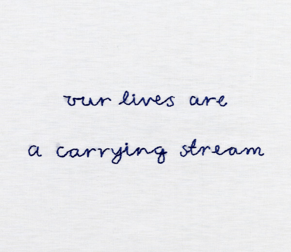
“The scent of rain left on the moon”
“The speed of light
slowed to absolute stillness”
“a drawing made
from the ashes of stars”
“the surface of the moon sculpted onto white cliffs” I’ve got quite a vivid imagination, so I find all of these phrases pretty compelling without any further input. My favourite is “The scent of rain left on the moon”. It really tickles my imagination. It makes me think of the smell of earth and grass after rain which in turn takes me back to a variety of locations and therefore that phrase has given me a sense of place. The same could be said of “a drawing made from the ashes of stars”, it brings to mind the stars, the solar system, the Sun, and as the mind wanders back towards Earth…a sense of place in the Solar System. I’m finding ‘place’ a lot easier to relate to than ‘time’.
Make a list of the artists mentioned in Dean and Millars essay. Look up at least one piece by each of the artists mentioned whose work incorporates text. How many of these pieces are relevant to the theme of place and how do they reference place?
Vitaly Komar and Alex Melamid I’ve listed these two together as they worked together so closely that even when just one of them made an image they chose to sign them together. They created a series of paintings called ‘Peoples Choice’ where after using questionnaires by country they would identify the factors most and least wanted in a painting by that countrys demographic. Below is Americas Most Wanted.
This is relevant to the theme of place as in the majority of countries, it was a place or location which the questionnaires respondents listed as a desirable scene. It is also relevant to place as it is an accumulation of views taken from one specific geographical location. The responses will be governed by the different living conditions, economic hardships and political structures present in each particular country.
These neon letters bolted to the wall seem to be something of a contradiction as they are neither blurred or vague nor unstable. I imagine that they could be deemed as relevant to a sense of place as something like a comment on the fleeting nature of an average lifespan and everyones quest to leave the planet, their place, in better shape than they found it. I struggle with this as I really do not see how neon lettering can be thought of as art.
I’ve read the blurb that accompanys this image on the Tates website. The blurb itself does not mention place at all, I had a different thought process entirely when I looked at it myself.
To me the references to place are quite heavy despite being unspecific. The nearest thing to philosophy that I have seen that I like is the old question ‘when a tree falls in a forest does it still make a sound if thee is no-one to hear it’. This piece with it’s two lines reading “to see a landscape as it is” “when I am not there” reminds me of that old question. I think of trees and forests which I love, of deforestation and the relentless spread of humaity over the planet and into the wild places which I hate. It’s quite sad.
So, for me, this piece invokes a sense of place.
4. Doug Aitken
Time for me to chew some humble pie. I’ve found a piece of contemporary art that I love.
For me, this piece is class. It summarises rebellious spirit, adventure and daring to push the boundaries of whats possible. In terms of place there is the obvious reference to Planet Earth, this itself refers to outer space. In terms of the viewer it took me straight back to being 18 with the world at my feet, when anything was possible. More of a time in life than a place.
This is one of Finlays stones from his garden entitled Little Sparta. It references the Romans which immeadiatley gives the viewer a sense of context, it gives us a sense of time and place. It also makes a clear and easy to understand statment. The Romans (as Monty Python explained) did a lot for us. We have not had an era of such innovation yet which could possibly compare.
This collaboration work references a sense of place in a broad sense. It gives the viewer the option of regarding where they are right now, where they were previously or where they intend to head in life. I like the idea that everything is connected, I dont think that anything is pre-ordained but I do think we can choose which route we take.
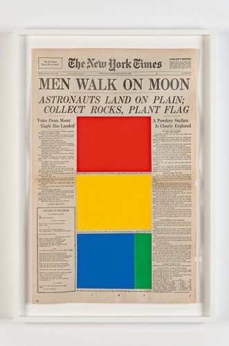
I found that with a lot of Marine Hugonniers work it was the isolation of previously established text which formed the artwork. In this example of a newspaper front page depicting the moon landing the star of the show should be the image of Neil Armstrong stood on the moons surface. Instead the text is all that remains so the viewer is forced to imagine the scenes for themselves to fill in the blanks. In this sense, we are forced to generate a sense of place for ourselves.
In Robert Smithsons ‘A Heap of Language’ in a very basic sense it gives me a sense of place. It visually looks like a hill and when walking in the hills I always find that they make my mind more eloquent…wordy. It vaguely reminds me of the opening sequence of Star Wars (the angle of the text) which in turn takes me back to being in our ratty local cinema. Except when it’s the only cinema you’ve ever been too and the biggest screen you’ve ever seen, it’s more of a palace. If I shut my eyes I can see the pink lights on the walls, smell the popcorn and feel the tackyness on the floor.
9. Guy Moreton
I could not locate any work by this artist that used text and referenced a sense of place. Whilst reading through his bio I did learn about a collaboration project that he carried out with Alec Finlay and Micheal Nedo entitled Ludwig Wittgenstein – There Where You Are Not. It explores landscape and the architecture of landscape, but from what I could see, without text.
An artist that I have heard of! I knew that Blake was famed for being a poet but I had no idea that he also painted, exhibited at the Royal Academy and opened a print shop. I read a lot about his various work and found that he released a series of poems called ‘Songs of Innocence’. It seems that these poems were originally presented with watercolour paintings. I have not been able to locate examples of the two together but I did find the poems themselves online.
I could not find any examples of work by this artist using text which referenced a sense of place.
Caspardavidfriedrich.org. (2019). Caspar David Friedrich – The Complete Works – Biography – caspardavidfriedrich.org. [online] Available at: https://www.caspardavidfriedrich.org/biography.html [Accessed 18 Jul. 2019].
12. John Constable
I could not find any examples of work by this artist using text which referenced a sense of place.
John-constable.org. (2019). John Constable – The Complete Works – Biography – john-constable.org. [online] Available at: https://www.john-constable.org/biography.html [Accessed 18 Jul. 2019].
13. Martin Heidigger
I could not find any examples of work by this artist using text which referenced a sense of place.
I could not find any examples of work by this artist using text which referenced a sense of place although I did find a large catalog of paintings which featured a lot of landscapes.
Nicolaspoussin.org. (2019). Nicolas Poussin – The Complete Works – Biography – nicolaspoussin.org. [online] Available at: http://www.nicolaspoussin.org/biography.html [Accessed 18 Jul. 2019].
15. Dan Graham
I could not find any examples of work by this artist using text which referenced a sense of place.
I wasnt sure which Jane Wilson I was supposed to be looking at so I also checked out the work of the identical twins Jane and Louise Wilson. Again, I could not find any examples of work that included text and referenced Place.
I struggled to find a decent information source for Alexander Maris. From what I can see he is primarily a photographer and does not appear to use text in his work.
Again I struggled to find a good information source for Susan Maris. On one website under ‘biography’ all it said was “Alexander and Susan Maris is an artist” ! There is evidence of photographic work attributed to both the Maris’s but no solo work that I can see, and nothing that uses text.
I found this exercise quite frustrating. Although it was interesting looking at the different artists work and learning some new things, to find that so many of them do not use text initially made me think that I wasn’t reading around enough. After spending a couple of days exploring different sources and satisfying myself that my initial impressions were correct I do not feel that what I have submitted for this research point reflects the amount of time I have put into it.
But, on a positive note, I’ve found some Contemporary Art that I quite like. I’ll be looking at more of Doug Aitkens work at a later date.
This exercise instructed me to watch a video of an artwork by Sam Taylor-Woods. This video which I accessed at https://youtu.be/BJQYSPFo7hk was a time lapse video of a bowl of fruit decaying.
I am
puzzled as to how this can be classified as art. Maybe it is a statement on the
perishable nature of life? Maybe it’s supposed to be a reminder that fresh food
is better for you but it goes off fast? Maybe it’s a statement that peopleare
ignoring their health and thereby their lifespans are shortening? Maybe my
ideas that art should be something beautiful and good are wrong?
The media
and form of the piece
The piece
is, I’m assuming, the video as opposed to the rotting bowl of fruit. As a form
I normally quite enjoy a time lapse video, the ones I see are more often things
like sunsets or speed-art photoshop videos on Youtube. Seeing that someone has
decided to apply time lapse video to something like decaying fruit was a bit
of shocker for me. Initialy the setup of
the fruit looked quite classical and reminded me of a Caravaggio still life. In
classical old paintings of bowls of fruit there were often nods to death or
references to the impermanence of life, maybe by using video in this form
Taylor-Woods is putting a modern spin on classical techniques?
What do
you think has influenced this piece?
A lot of
things could have influenced this piece. It could be a modern spin on a
classical approach to still life, it could be a piece about the passing of
time, or it could be a shock and awe exercise reminiscent of Damien Hirst. I
had a look around at some of Taylor-Woods’ other work. A video which I accessed
on YouTube at
https://youtu.be/NYka4ouQXqk (YouTube. (2019). Sam Taylor-Wood – A Little Death [720p][2002]. [online] Available at: https://www.youtube.com/watch?v=NYka4ouQXqk [Accessed 17 Jul. 2019]. ) entitled ‘A Little Death’ shows a hare and a peach rotting. As the video continues the maggots erupt from the body of the hare and consume it. Weirdly very little happens to the peach.
Again I found this quite gross to watch. There are different messages
that the artist might be trying to put across, it could be a statement on the
life cycle, how maggots will consume us all. Maybe it’s a statement on how we
all feed off each other. Having read a few essays about Hirsts shark in a tank
I imagine that it’s more likely to be a darker approach about how something
like a consumerist society destroys all life and feeds off the broken carcass
of it’s participants. Just a guess. I’ve noticed that not many of these modern
artists seem to be wanting to spread messages of positivity and rainbows.
Talking of Damien Hirst, one of his early works which attracted him much
publicity was a rotting cows head (complete with maggots) inside a tank. The
tank even included smell holes to allow viewers of the piece to ‘engage
further’ with the installation. Freud commented on it along the lines of that
Hirst had opened his career with his best work.
The rotting cows head with maggots rings bells when I look at
Taylor-Woods ‘A Little Death’. Is it a deep statement or is it more like one
artist craving a bit of notoriety of the other and so is embracing the same
concept?
How does this piece comment on
time?
This
piece comments on time in several different ways;
There is
the more basic passage of time shown by the way the hare is being devoured by
the maggots.
There is
the relation to time shown by the speeded-up video which is what the viewer
sees.
There is
the way that seeing a video of a still life with its references to death
relates to the classical painters of hundred of years ago.
There are
possible references to vegetarianism, currently a very popular trend. This can
be seen in the way the hare is devoured so much faster than mould starts to
affect the peach on the left hand side.
In 250 words describe your understanding of this
piece
Having
made some notes of different aspects of the piece I believe that this video is
about time passing. I think that Taylor-Wood wants us to think about how short
a lifespan is and how everything ends with decay no matter who you are. I think
this is symbolised by the choice of the hare, hares traditionally win races but
this one has met the same end as everything else. This is further echoed by the
maggots, they live breathe and breed just the same as we do and we get to see
their life cycle play out as they feed on what has gone before.
There are several different refences to time
in this piece. The initial set-up echoes early still-lifes as depicted by
Renaissance painters, this allows Taylor-Wood to show how far technology in art
has come by using different methods to show the same relationships between life
and death.
The choice of video as a medium has allowed
further references to the passage of time. The actual event of the hare rotting
would have taken several days, possibly weeks. This is delivered to us in
minutes thanks to technology. There is also a possible relationship here as to
how long traditional paintings of still life would have taken to create as
opposed to how we can use for example digital cameras to swiftly create the
same stunning images.
I think the use of video has allowed this art
piece to be more user friendly (no Hirst-like smell holes here!), the choice of
this media makes it accessible and gives it longevity.
Time, most often I think about how
I’d like more of it! I think the most interesting idea about time for me is
time travel. Ideas brought up by various sci-fi films/series make me wonder
about what time travel would be like, whether going against the kill-your-own-grandfather
stratagem would create a radical new future or if time is more like a river and
it would just find a way around the obstacle.
I’d love to travel forward in time,
just to see what mankind does with the technology of today, do we continue
destroying the planet or do we find a way to save it? I’d love to pop back in
time too and see things like Roman roads being built and compare them to say
the M1 now or the National Trust castles when they were at the height of their
power.
I find it pretty cool looking at
something really old and just imagining all the hundreds of years that an
object has been through and all the various people that might have seen and
handled it.
I also find it sad when people want
to rewrite the past for a better story. For example the current movement to
make history taught in schools less ‘imperialistic’ and ‘colonial’. Guess what,
we were an Empire, we ruled vast swathes of the planet and we did it using some
pretty questionable techniques in some cases but it happened. Whether you love
it or hate it, that is our history
and we need to learn from it. Statues to great heroes from the past are
vandalised by people who read social media fake news about things they don’t
understand. Churchill saved our nation from assimilation by a German war
machine, yet you see students on the news frantically screaming that he was a
right wing oppressor of liberties.
People either do not know or choose
to ignore what has happened before and that is the easiest way for our country
to get dragged into making the same mistakes all over again.
Have you thought about time in relation to art before?
The only real way in which I have
thought about art before is in terms of how it can transport you to a different
time and place either of imagination or creation.
A well crafted image/TV series set in
a different time can detach you from where you are so completely that looking
away from it/coming to the end of a series feels like resurfacing.
An image of a scene from somewhere
you have previously experienced can take you back there in an instant. You can
smell things, hear and taste things, sensations that may have been lost in a
memory until that moment.
Have you already come across pieces that explore what time is?
I have not yet come across any pieces
of art that specifically explore what time is. To be honest I generally only
look at illustrations related to children’s books or photography on the theme
of nature/portraiture.
In a way you could use almost
anything and link it to the exploration of time. There is an artist who uses
toy Etch-a-Sketch’s to produce portraits of celebrity’s and recreate famous
paintings. You could argue that one of his finished Etch-A-Sketches represents
time, the time he invested into creating each piece. If you wanted to get
philosophical about it you could say that shaking the Etch-a-Sketch and
destroying the image on the screen is representative of how time once gone is
gone forever.
I had a look around online and discovered an interesting artist called Raghava KK. He creates a lot of works based on the idea of Evolution. Evolution could be applied in several contexts, the one which I think is most common is that of the passing of time.
In the article entitled ‘Exploring
evolution through a surreal blend of pop culture’ from 26th August
2015 he explains about his drawing style and the ideas behind his pieces. It
was all reading very well until the end when I read a quote that makes me
cringe “My
paintings are not new media – they are very much the traditional paint on
canvas. But the way I see the world is extremely avant-garde.” . With that
last line he reminds me of Damien Hirst. This is very likely just as a result
of my bias against modern art but what I find myself asking is ‘why do they all
want to be some kind of special snowflake?!’
The course folder talks a little about an artist called Tacita
Dean who displays animal noises captured on physical tape as a length of tape
within a frame. This explores time in several ways. Initially the length of the
tape shows the length of the noise that the animal was making. The display of
the tape without the accompanying noise means that he viewers mind takes them
back to a place where they last heard that noise and plays it for them. From
yet another angle the choice to display the tape, a variety which is no longer
printed in the UK is a statement on the passing of time as technology has
rendered it obsolete. Where would you even start in the quest to play a 16mm
tape if you found one at a boot fair?
So yes, Tacita Deans work explores the passage of time from
several different angles. Displaying time as a thing which can actually be
measured by something physical is an interesting approach. Again though, again
I’m struck by how daft I find it that this is called art. I could put my workboots
on a pedestal in a gallery and call them ‘war and peace’ (the different injurys
the boots have picked up being souvenirs from such destinations as Afghaistan
etc, the road to peace being measured in the tread worn away from their soles)
but that wouldn’t be art either!
In this task I am to read an extract from ‘Entrance: Place- The First Of All Things’ and make some notes about how closely related time and place are, in particular when I experience work at an exhibition.
Time and Place are two things that I
had never considered together until beginning this module. When I read the two
designated pages what struck me most was what the authors state on Pg 14 ‘When
space feels thoroughly familiar to us, it has become place’. This is very true
and not something I had considered before.
Contents of art works often represent
either time or place or a combination of the two. When looking at pieces of art
I often find myself transported to a different place either of memory or
imagination, this can often go hand in hand with losing track of time in my
present location!
I find I’m struggling to generate any
further thoughts on these two themes. From having a brief look at other
previous students learning logs I see that people have written reams of rather
philosophical responses but I’m just not wired up to think in that way.
In this exercise I am to find two examples of still life work that includes fish and in each case note the title, artist and date. I am to make quick sketches of them in my learning log.
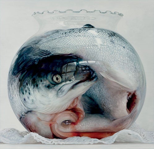
The two examples of still life including a fish which I chose to use are quite different from one another. The first is a photographic example which I found at The Guardian online.
This artist (Cindy Wright) has created a series of images to remind people about the cost of eating meat. All this image reminds me of are the needless displays of aggressive veganism at locations like Turkey farms and in the meat section of supermarkets. If we all had to kill our own meat then a lot of people may well choose to become vegetarian, personally I think that would depend entirely on how hungry people became. Everyone should know where their food comes from but equally there’s no need to dress it up. Again I find that this is an arrangement of objects to make a point but not something that I consider to be art.
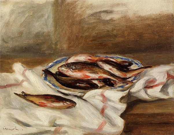
My second choice of still life is an impressionist oil painting called Still Life with Fish by Pierre Auguste Renoir from 1890 which I discovered at WikiArt online.
I do not think there are any hidden meanings in this image, I believe that it has been produced purely for decorative purposes. This, to me, is an example of art. It serves a purpose and it took a lot of skill to complete.
I now have to watch a video discussion from the Khan Academy about Hirsts piece. I am to list the different areas of context that are covered and any references to ‘time’.
Arts relationship to the understanding of mortality
Physical construction of the artwork
How open to interpretation art from the 20th and 21st century is
Survival instinct of the human brain
The disintegrating nature of the shark and how that can be a metaphor for normal life
The impermanence of art
The sophistication of Damien Hirst and the potential thought he put into the design of the piece
The establishment of museums of philosophy
References to Time;
favourite piece of art in last 3-4 decades
the history or art coming to terms with mortality
art through history
20th and 21st century compared to renaissance
post the movie ‘Jaws’
2nd shark that has been displayed in this tank
“his design didnt hold up to time”
transgenerational nature of art
art changing over time
Egyptians mummifying bodies
the inevitability of decay
museums as time capsules
Whilst listening I was also to listen out for information on several other headings;
Hirst – It is decided that it was Hirsts ‘sophistication’ that led to him choosing to display the shark in a tank of formaldehyde. ‘He created the impossibility of its preservation’.
The Piece – The title of the piece is remarked upon as being just as profound as the piece itself. The full experience is described as including both the piece AND the title.
Hirsts other work – It is mentioned that he also slices sheep in half and displays them in tanks.
Information on other artists whose work is concerned with mortality -Duchamp is quoted as saying “A work of art is completed by the viewer”. No other artists are mentioned.
Has the contextual information about The
Physical Impossibility of Death in the Mind of Someone Living altered your view
or response to it in any way?
Yes it has. My
initial response to this installation was exasperation. Having read further
online in essays previously referenced about the links between Hirst’s shark
and capitalism through the decades I can now see how it represents a many
layered message. I’ll certainly never be able to watch ‘Jaws’ in the same way
again!
Even with my
further enlightenment I still have not changed my definition on what makes
something art. Having to go and research something to understand it, in my
opinion, means something is unsuccessful as a concept.
Well I’ve read the article and I’m
firmly on the side of the author. When I read that he had been classing Hirsts
work as ‘memento mori in the pursuit of a reputation’ since 2009 I actually
laughed aloud. I couldn’t agree more.
He assembles objects which provoke a
reaction, yes. Unfortunately that reaction is normally one of disgust. Is it
necessary to continually present once living things in tanks of formaldehyde? I
am currently sat in the Falkland Islands where I am being forced to work with
the Army. One of their favourite games at the moment is to try and poo on the
floor in as public a place as possible without being caught. Seeing this
mornings turd outside the hairdressers provoked a reaction in me all right but
it certainly doesn’t make it art.
This exercise
focussed on a work of art by Damien Hirst entitled The Physical Impossibility
of Death in the Mind of Someone Living.
Write down a few words giving your first
reaction to the piece
The name of the
piece seems unrelated to the actual artwork. It seems to be a dramatic
statement with very little point.
Do you have an emotional response to it?
My main
emotional response to this was a sigh of exasperation. I find Hirst to be a
showman with no substance, when you look past the glitter there is very little
for me to see there.
What do you think it’s about?
I think this
piece is about the fact that someone is only truly dead when no-one still
living remembers them. Photos and
mementoes of a persons life may record the fact that they walked the Earth but
the actual person themselves is only remembered by those who knew them.
Within this article
the author compares Hirsts shark to Capitalism, an idea which initially I
scoffed at but the ore I read through the pages the more I understood him to be
correct. Even though I now understood the symbolism of the shark and how the
film Jaws was a any layered stamen about how we live in a controlled state, I
was still unimpressed by Hirsts installation, like a doughnut without a filing.
And then…
I scrolled through the essay a little more and I found another installation by Hirst which I understood immediately.
‘The Acquired Inability to Escape’ symbolises exactly what I hate about working at a desk. It feels as though you are trapped in a box with no room for individuality or spark, no sense of joy or satisfaction is allowed to enter the box. As entrepreneur Daniel Priestley describes in his book ‘Entrepreneur Revolution’, we in the Computer Age are subject to a system which directs us through a certain life path, it makes us worker bees. The system also looks after us, I do not mean to infer that we need to set fire to the institution, merely that I can empathise with this piece. In my current job I am not trapped at a desk all day, I am merely trapped in the wrong industry. Being an engineer bores the pants off me, every work task is like being stuffed into a box like this, a box of the mind, in addition it is one of the reasons that I started this degree! To escape!
Having stared at this installation for quite a while I have come to the conclusion that I have misjudged Hirst, maybe the Shark in the tank does for some people what that desk in a box is doing for me.
What do you
think about the title?
I think the title of Hirsts shark installation is
part of the piece. It has to be because without it you would have no idea what
point Hirst was trying to make. In my opinion you should be able to look at a
piece of art and be able to tell what it is about without having to read the
exhibition programme. I am also of the opinion that you shouldn’t have to read
the name of something to know what it is, the one exception being the artistic
car crash (often with added superglued pasta) being thrust at you by a proud 6
year old or similar.
When considering the title of Hirsts piece I also find that it carries a message all by itself, I do not need to see a giant shark in a tank of preservatives to be able to generate meaning from his choice of words. I am sure I should be saying that the shark adds value to the piece as a whole, that it creates some kind of valid point worthy of consideration. But try as I might I just cannot come to that conclusion, I think Hirst is making a valid point but his choice of illustrating it is about as effective as the Brexit Bus. Not enough information, over the top showing off, it just annoys people.
I then had to look at a vanitas painting by Edward
Collier called ‘Still Life with a Volume of Withers Emblemes’ painted in 1696. The
same questions were to be answered.
Write down a few words giving your
first reaction to the piece
Talent. That silver
bowl at the front left is ridiculously lifelike. Warm light is welcoming.
Myriad of interesting objects to spot. It’s a picture to investigate.
Do you have an emotional response to
it?
Yes. I am drawn to
this painting. The warm light makes it a welcoming scene for me. I am also
drawn to the cluttered nature of the elements within the frame. A picture that
I can investigate is one that I can spend hours looking at. Whilst
investigating each element I am very impressed by the level of talent of the
artist. The realistic renderings of each individual item are very impressive
and demonstrate a skill level which I can only dream of attaining.
What do you think it’s about?
Initially I was wondering if the painting might be about showing off. The images contains food, music being played ad poetry being read which in former times were tools one would use to show off in society. In truth it reminded me of me being sat here right now attempting to learn my way through Art Theory, as soon as I attain this degree I will be dropping it into conversation and showing it off at every opportunity (hence the link!)
I then read further in the course manual and read the description of the contents given to it by the Tate website. This description informed me that it was more along the lines of mortality and contrasting it with death. I found that quite interesting because I associate the warm glow of the paining and the objects within to be more elements of life! Collier arrived in London in 1698 to sell still life paintings to the English market, I am curious to know whether this influenced his choice of objects within the frame. I imagine he made it more to do with life than death for this reason. Not many people would choose to pay money for a morbid painting to hang on their wall!
The more I study
this painting the more interesting I find it. I found the arrangement of items
particularly good. By this I mean how the book page with the mans face on is a
natural point of focus and has been positioned on the top left thirds point.
The way the light falls on this page means that it took me a while to spot the
skull in the shadow on the top left hand corner. The bright light on the objects
on the left and the contrast with the darker negative space on the right draws
the focus of the viewer to the objects that symbolise life as opposed to death.This
could possibly be a nod towards the fact that the majority of people are drawn
to life, to fight for it against sometimes impossible odds.
What do you think about the title?
The title of this
piece in contrast to Hirsts is a lot more descriptive. It tells you what is in
the image rather than directing you in how to respond to it. I am unsure as to
whether this is for more practical reasons, ie because the original name of the
piece got lost through time and a museum had to give it one for the sake of
differentiation at a later date or whether this really is a practical title
that Collier gave his piece.
It works a lot
better for me than Hirsts title. I needed Hirsts title to make sense of the
installation that he presented. I would far rather be left to explore a
painting like Colliers for myself and come to my own conclusions.
In this exercise I am required to read an excerpt from ‘Art History: The Basics’ by Grant Pooke and Diana Newall (2008, Abingdon: Routledge) Pages 1-8. I am to make notes on any parts that require further research or that jump out at me as particularly meaningful. I am also to identify any words that are new to me and list them.
The one item from this extract which really struck me was the initial tale of David Hensel submitting a sculputre of a head for an art exhibition, and how the plinth that accompanied it became mistakenly identified as the exhibit instead. That one of the traditional academy arts should be mistaken for a piece of Contemporary art strikes me as quite amusing.
I’m not a fan of Contemporary art myself so the idea that someone can look at an empty plinth and not think ‘maybe there’s something that should go on top of that’, just seems a bit nutty.
Throughout the text I noted down all words that were new to me. The words and their definitions are listed below.