Looking at the assignment criteria in the introduction of the course manual I feel that I have submitted a decent essay for Assignment One. I believe that I have ticked off all the content requirements listed.
To improve this essay I would balance out my arguments a little more. Currently, due to my own life experiences I am firmly on the side of the institution and law and order. This has been further reinforced by working through this Part 1 of the module where so much of the online research I have had to complete has been relentlessly presenting me with a leftist view of the world. Reading about people who present actual turd (Piero Manzoni) or toilets (Duchamp) and call it ‘art’ has been driving me potty – excuse the pun. I think this has probably contributed to my quite one-sided view of Deller’s Battle of Orgreave.
On re-reading my essay what I like is how I’ve tried to use structured reasons to describe my opinion of the re-enactment. I wanted to reference as many different relevant sources as I could to demonstrate that I can relate outside articles to the topic in a constructive manner. I think that the essay flows quite naturally from one point into the next which I like, this is the first essay I’ve written in a while so hopefully the knack of them will come back to be soon!
My views on what art is have definitely
changed a bit. I can now see that something doesn’t have to be a physical image
to stimulate imagination or recreate a sensation. I’ve racked my brain
attempting to find a word to categorise Contemporary pieces as something
different but have come to the conclusion that as much as I dislike it, it is art. Whereas my own tastes have not
changed I can now see that whereas I prefer a physical rendition of an image
and take stimulation from that, for other people the image is not needed. They
only need or want to be stimulated in a certain direction and to fill in the
gaps for themselves.
As a result of completing Part One I have learnt several things. I have
learnt that popularity is not a guarantee of quality, attention can be drawn to
items because of their shock value rather than their skill content. I have
learnt the value of looking at lots of different sources to find a range of
opinions on the same topic. I have also learnt that there are a lot more
sources of information on the internet that I should be consulting than I had
previously realised. With this, the value of ascertaining whether the source is
Primary or Secondary has also become more obvious to me.
Bearing in mind my limitations resource-wise (sat on a military outpost in the Antarctic Circle with limited internet) I think my Learning Log is progressing quite well. Currently it suffers from lack of external material such as postcards, and I am not capable of getting to any exhibitions. I am attempting to remedy this by exploring collections of work online. It could be improved by more research, there is always room for more research! I think my learning about Contemporary Art could also be improved by more exploration of somewhere like the Tate Modern, ideally in person. Another lesson I have picked out to take with me is the power of suggestion. Until now I have always striven to provide an entire message within an image, experimenting with leaving the interpretation a little more open to the viewer is something which could be interesting to explore.
Part B
Interpret
Jeremy Deller’s Battle of Orgreave and reflect on the importance of time and
place in this piece. Write 800-1000 words.
Post Tutor Feedback
My tutor made many excellent points in post-assignment feedback, some of which I wish to incorporate into the essay prior to submission for assessment. These are;
giving the reasons that I disagree with Jones comparison to a Renaissance painting
countering my own view by presenting both sides of the argument
adjusting my remarks about the job of the military vs the police
make my essay less of a political statement about status quo and refocus on Dellers interpretation of Orgreave
adddress whether I consider Deller to have told the truth/have a bias/have an opinion
Below is the text of my revisited essay, following that are my references and then the original essay to allow easy comparison.
Revisited Essay
In this essay I am going to interpret Jeremy Deller’s work ‘Battle of Orgreave’ and reflect on the importance of time and place within the piece.
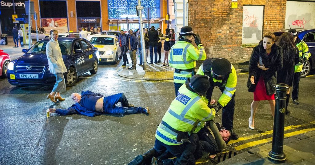
Having read about some of Dellers ideas for projects in the Guardian article (https://www.theguardian.com/culture/2001/jun/19/artsfeatures), particularly the Northern brass band playing acid house tunes, I am not sure that even the artist thought that his proposal would be accepted by Artangel. Initially I was doubtful about whether enactment could be classed as an art. In his article for the Guardian newspaper journalist Jonathon Jones makes the case that the placement of members of the cast in various scenarios resembles a Renaissance painting, a reflection of Dellers education in Art History in which he specialised on the Baroque. I disagree with the comparison to the old masters because I do not see any particular conventions adhered too or familiar groupings of characters. However I do see that this re-enactment, and the emotions it would provoke in the onlookers does fit my new found definition for Contemporary Art as I described in Part A. There is one photograph which sprang to mind at the Renaissance reference. In another Guardian article. https://www.theguardian.com/uk-news/2016/jan/03/like-a-beautiful-painting-image-of-new-years-mayhem-in-manchester-goes-viral)
This photograph taken by chance by Joel Goodman on Wells Street in Manchester on New Years Eve 2015, became famous for it’s characters positioning and accidental adherence to the Fibonacci Spiral. Whilst considering this photograph I realised that there could be many different angles to Deller’s composition. By using reenactors he allows people not just to see the art through the medium of photographs or pictures, but also to experience it, to live it. It would be the equivalent of stepping inside a historical film on tv.
The importance of time if the piece is apparent in many ways. In practical terms the co-ordination, literally the timing, of so many reenactors to recreate so many previously recorded events would have been a mammoth undertaking. The timing of the re-enactment, approximately 20 years after the actual event, links the events of Orgreave with a new generation. Something that the young people of the area would only have heard about from their parents would be made real for them providing a shared experience. Reenacting events with participants from the original ‘battle’ could also potentially give them the opportunity to readdress their bias of the time. Often strongly held beliefs can colour recollection of events. The choice to have the reenactors in historically accurate costume set against the backdrop of modern Orgreave shows the passage of time in several ways. Most obviously this will be illustrated in the fashion of the different eras but also in the rejuvenation of the area since the 80’s and the strikes.
As described in ‘Place’ by Dean and
Millar (page 14) ‘many important historical events are now known simply by the
place in which they occurred’, or as James Joyce in a preparatory note to
Ulysses wrote, ‘places remember events’. Normally this refers more to events
such as Hiroshima which shaped the course of human conflict, but, on a more
local scale, the same can be said of Orgreave. The re-enactment had to be staged in Orgreave, the action
and the location are the two essential elements that give the event meaning.
Taking the action and playing it elsewhere would not make any sense and vice
versa.
I find that the messages that come out of the combined art experience, the re-enactment and the subsequent installations are mostly inflammatory and anti-establishment. Being in the military myself also gives me a particular view on the event and therefore the messages I receive from the reconstruction. The main job of the military is to fight the enemy and win, the main job of the police is to protect the people. If the military are instructed to act as the police, the people become the enemy and that would have lead to even worse confrontations, therefore it was not the military the Unions organised gangs had to deal with. The miners were breaking the law, the police acted accordingly and were met with heavy resistance. If the miners had dispersed as any law abiding citizen should, then Orgreave would never have happened. What frustrates me so severely is that when they chose to escalate the action and fight the police everyone acts so surprised that various officers ‘lost it’ and violent incidents ensued. The police are law keepers and people protectors, they’re not superhumans and they’re not trained for warfare. The message that in my opinion the installations are giving of some noble call to arms by the ‘victimised’ miners being quashed by the thuggish autocratic state is utterly ridiculous. The video on www.jeremydeller.org showing clips of the re-enactment footage alongside the original event footage serves only to reinforce the divisions in a society which for a few, may have finally started to fade with time.
The signature scene is of the miners being chased by a police cavalry charge, I think this is supposed to shock the viewer. Quite how else people imagine that rioters can be cleared out of a built up area to both contain the violence they are responsible for and protect everyone else is beyond me. In my opinion Deller has reawakened a ghost in Orgreave. The pits had to close, as it says in ‘Place’ Pages 106-107 global capitalism dictated that local identity had to be sacrificed for the international trade in commodities. It was devastating for the communities involved but it made financial sense for the country.
The recreation of events cannot be classed as having a bias, they were recorded at the time, however I heavily question the way Deller has presented them. From my experience of the exhibition, the bias of the presentation is anti-establishment so in my opinion Deller cannot be classed as a neutral party reawakening history.
Deller has thoroughly but needlessly made fresh the arguments from both sides, I would rather have seen him spend Artangels commission on the Northern brass bands playing acid house music.
In this essay I am going to interpret Jeremy Deller’s work ‘Battle of Orgreave’ and reflect on the importance of time and place within the piece.
Having read about some of Dellers ideas for projects in the Guardian article (https://www.theguardian.com/culture/2001/jun/19/artsfeatures), particularly the Northern brass band playing acid house tunes, I am not sure that even the artist thought that his proposal would be accepted by Artangel. Initially I was doubtful about whether enactment could be classed as an art. In his article for the Guardian newspaper journalist Jonathon Jones makes the case that the placement of members of the cast in various scenarios resembles a Renaissance painting, a reflection of Dellers education in Art History in which he specialised on the Baroque. I disagree with the comparison to the old masters but I do see that this re-enactment, and the emotions it would provoke in the onlookers, does fit my new found definition for Contemporary Art as I described in Part A. There is one photograph which sprang to mind at the Renaissance reference. In another Guardian article. https://www.theguardian.com/uk-news/2016/jan/03/like-a-beautiful-painting-image-of-new-years-mayhem-in-manchester-goes-viral)
This photograph taken by chance by Joel Goodman on Wells Street in Manchester on New Years Eve 2015, became famous for it’s characters positioning and accidental adherence to the Fibonacci Spiral. Whilst considering this photograph I realised that there could be many different angles to Deller’s composition. By using reenactors he allows people not just to see the art through the medium of photographs or pictures, but also to experience it, to live it. It would be the equivalent of stepping inside a historical film on tv.
The importance of time if the piece is
apparent in many ways. In practical terms the co-ordination, literally the timing,
of so many reenactors to recreate so many previously recorded events would have
been a mammoth undertaking. The timing of the re-enactment, approximately 20 years
after the actual event, links the events of Orgreave with a new generation.
Something that the young people of the area would only have heard about from
their parents would be made real for them providing a shared experience. The
choice to have the reenactors in historically accurate costume set against the
backdrop of modern Orgreave shows the passage of time in several ways. Most
obviously this will be illustrated in the fashion of the different eras but
also in the rejuvenation of the area since the 80’s and the strikes.
As described in ‘Place’ by Dean and
Millar (page 14) ‘many important historical events are now known simply by the
place in which they occurred’, or as James Joyce in a preparatory note to
Ulysses wrote, ‘places remember events’. Normally this refers more to events
such as Hiroshima which shaped the course of human conflict, but, on a more
local scale, the same can be said of Orgreave. The re-enactment had to be staged in Orgreave, the action
and the location are the two essential elements that give the event meaning.
Taking the action and playing it elsewhere would not make any sense and vice
versa.
I find that the messages that come out of the
combined art experience, the re-enactment and the subsequent installations are
mostly inflammatory and anti-establishment. Being in the military myself also
gives me a particular view on the event and therefore the messages I receive
from the reconstruction. The job of the military is to fight the enemy and win,
the job of the police is to protect the people. If the military are instructed to act as the
police, the people become the enemy and that would have lead to even worse
confrontations, therefore it was not the military the Unions organised gangs
had to deal with. The miners were breaking the law, the police acted
accordingly and were met with heavy resistance. If the miners had dispersed as
any law abiding citizen should, then Orgreave would never have happened. What
frustrates me so severely is that when they chose
to escalate the action and fight the police everyone acts so surprised that
various officers ‘lost it’ and violent incidents ensued. The police are law
keepers and people protectors, they’re not superhumans and they’re not trained
for warfare. The message that the
installations seem to be giving of some noble call to arms by the
‘victimised’ miners being quashed by the thuggish autocratic state is utterly
ridiculous. The video on www.jeremydeller.org showing clips of the re-enactment
footage alongside the original event footage serves only to reinforce the
divisions in a society which for a few, may have finally started to fade with
time.
The signature scene is of the miners being
chased by a police cavalry charge, I think this is supposed to shock the
viewer. Quite how else people imagine that rioters can be cleared out of a
built up area to both contain the violence they are responsible for and protect
everyone else is beyond me.
In my opinion Deller
has reawakened a ghost in Orgreave. The pits had to close, as it says in ‘Place’ Pages 106-107 global capitalism
dictated that local identity had to be sacrificed for the international trade
in commodities. It was devastating for the communities involved but it made
financial sense for the country. The Unions had to be broken, no organisation
can be allowed to hold the Government to ransom otherwise civil wars won’t be a
matter of re-enactment, they’ll be on the streets outside your front door and
the first person you’ll be wanting to turn up is a policeman. Deller has thoroughly
but needlessly made fresh the arguments from both sides, I would rather have
seen him spend Artangels commission on the Northern brass bands playing acid
house music.
I started
Creative Arts Today prepared to have a more open mind and knowing I would find
this initial section on Contemporary Art hard. It has been a struggle trying to
keep questioning and find understanding for things which I see as
grandstanding. The finest example of this is Damian Hirsts shark in
formaldehyde, I’ve read several essays on that now all explaining to me how
many layers of meaning there are but I just can’t take it seriously. What
surprised me most about my responses to this module is that even when I really
looked deeply into it, I could find nothing that appealed to me. If that means
I’m doomed to be a cultural peasant for the rest of my life at least I’ll know
I’ve tried!
I haven’t felt inspired by any of the works that I’ve looked at, that’s quite a strong word. There are several Illustrators and Photographers that inspire me but nothing from this module has stood out. The most interesting installation for me was the illuminated lettering ‘A Place Beyond Belief’ by Nathan Coley. Initially I was hopeful that this might prove to be a Contemporary Artist that I could get behind but these hopes were swiftly dashed when I started to explore the rest of his work. What really put me off his work was the Dundee based housing block in the Bristol church yard in response to Bristollian history. I’ve searched the internet out of sheer curiosity looking for any reasoning behind it, any sense, but am still bemused.
I have discovered one artist that I am interested in. Doug Aitken and his use of large letters containing photographic imagery. It reminded me of an exercise in Illustration One where we had to use mixed media to illustrate pairs of words, ie FAT would be bulbous and composed of McDonalds labels. He is one artist which I would like to look at further.
What has changed for me is my definition of
Art, or maybe rather, my understanding of what Art is for other people. I still
prefer my physical image depicting something, these images often prove to be
thought provoking/stimulating for me. I better understand now that other people
don’t want or need that physical image, they are happy just to be stimulated in
a particular direction and fill in the blanks for themselves.
For
the case study I must look at a piece called A Place Beyond Belief by Nathan
Coley.
What’s
your first response to this piece?
What
are the meanings behind the words? I can see a church roof, is it a statement
about heaven? Or is it more about what’s after belief? Death?
What
questions are you going to ask in order to make sense of the piece?
Is it site
specific? If so, where is it?
Who commissioned it and why? Were they motivated by
politics/religion?
In which year was it constructed?
Does it only comprise of the illuminated letters or
is there more too it? Does the scaffolding count as part of the piece or is
that just what the letters are attached too?
Does the time of day at which you view it matter?
Does the piece evolve or is this the finished
article?
What
type of work do you think this is? It could fit into several different
categories; how would you define it?
My
immediate reaction is to say, it’s contemporary art! That’s surely too obvious
an answer though so, if I had to pick a sub-category I would choose Text Art. Possibly
Text Sculpture is a better word considering that all the letters are quite
large physical items?
What
do you think the text is about?
I
think that the phrase ‘A Place Beyond Belief’ refers too either the afterlife,
what people of religions believe awaits us all when we die, or possibly just a
really strong sense of believing in something. From the initial image with the
illuminated lettering set against the stormy sky either of those could be
workable theories. With a different image taken from a different angle or at a
different time of day the message could be quite different. I’m assuming here
that the physical lettering on the scaffolding is the artwork here, not the
photograph.
Listen to the
monologue – what are your first thoughts?
I could not
access the given link to the monologue nor locate it when I searched, I did
however find an article from the Guardian newspaper in which the artist talked
about the creation of the piece.
My first thought is
that the text on the art installation is not religious as I initially thought.
It is a message of hope and aspiration, something for people to strive towards.
Religions with their differences often lead to wars but if everyone can look past
that and just try to be good people, the world would be a happier place and we
would all achieve a lot more.
What
other information can you find on Coley’s website about this particular piece?
The ‘view text’ link, centre top, is a good starting point.
Where is it actually sited? Does this change your response to it?
The installation is sited in Kosovo
outside a half built Orthodox church. The country is mostly Muslim, they were
oppressed by Slobodan Milosevic in the 1990’s and the church is seen as a
symbol of that.
The siting does not change my response
to it. The wording and it’s message is not site-specific but I would argue that
it is situation-specific. The original inspiration for Coley was the aftermath
of 9-11 in which it was obvious that people had to come together, to move past
differences of religion and work for a greater good. That is very similar to
the situation in Kosovo post-Milosevic. The Muslims were the majority and they
suffered under an oppressive regime, they could turn on the minorities much
like what happened in South Africa or they could all try and work together to
create a better future for their country.
Have your views on this piece changed
after listening to Coley speak about it? If so, why?
Yes my views have changed on reading
more about the origins of the piece. I initially thought that it was more
likely to be a religious statement, now I can see that it is about something
much bigger than that. My view changed on learning about the Sikh man on the
train experiencing misplaced hostility, now that I have that piece of
information I am better placed to apply a context to the wording on the
scaffold.
Can you see how this piece might take on
more political significance than we might have realised upon first viewing the
image on the page?
Yes, the message that Coley has chosen
to illuminate is particularly relevant to Kosovo. They are currently on the
road to being recognised internationally as an independent nation, though still
under supervised independence and with some way to go they are looking to the
future. It is said that those who forget history are doomed to repeat it, as
recently as the 1990’s whilst being oppressed by Serbia, all ethnic Albanians
(90% of the population) were banned from holding state jobs. Normally sweeping
acts like that are in the history books but that is still one in living memory.
That is exactly the kind of act that Kosovo wants to move away from, a mistake
that they do not want their politicians to make again. That is possibly why the
Guardian article talks about how it was the idea of Petrit Selimi, Kosovo’s deputy
minister for foreign affairs to have the installation in place for one month
and how there is an idea of the Government buying a copy of it to display in
their Parliament building as a constant reminder of where the nation has been
and what it is heading towards.
Do you think contextual information is
essential to gaining a greater understanding of contemporary art? Do you think
that it should be an essential ingredient?
Contextual information is essential to
gaining a greater understanding of contemporary art. Without it the various
pieces have no meaning or relevance and is a waste of time in both the creation
and the viewing.
What do you think about this piece, what
do you think it achieves?
I think that whilst this piece was on
location in Pristina, Kosovo it will have been a constant reminder that we need
to move beyond tribal differences and work together to make a better future for
everybody.
With something so large and outdoors, even when it has been taken away
again it is not the sort of thing that will be quickly forgotten. The
juxtaposition of it against a church which was a symbol of Serbian oppression
will have served to magnify the message that Coley is trying to spread. I think
that the installation will have had an effect locally, I think it will be a
reminder, those that forget history are doomed to repeat it.
The phrase “You imagine what you
desire” is a quote from a play, ‘Back to Methuselah’ Pt 1 Act 1 written by
George Bernard Shaw. The full quote is “Imagination is the beginning of
creation. You imagine what you desire, you will what you imagine and at last
you create what you will’. For an installation in Australia Coley chose to
split the text into different sections and install them seperatley. The
installations were not just confined to Australia, the above installation was
resident in Brighton in 2015.
This is my favourite of the variations of examples that I can see on Coleys website. The reason for my preference is the choice of Place. Brighton is very close to my hometown so I know it’s culture well. Famed as the gay capital of the UK it has a fun loving all accepting environment where people can be as flamboyant as they like. With Brightons reputation the topic of sexuality frequently gets associated with the most unlikely issues. I looked at this work by Coley inside a church and instead of thinking of religion I have thoughts of sexual tolerance and it’s occasional absence. The South East coast has a strong older population many of whom are a little bit stuck in their ways meaning that there are still such unfortunate scenes as people attempting to ‘pray the gay away’ out of their children. Also linked to this for me are the many individuals that I have known who have been passionately anti-gay only to burst out of the closet a few years later.
Moving in a totally different
direction and looking at it’s specific placement in a church as opposed to the
town, it could be a statement about faith. People imagine what they really
want, I imagine leaving the military, a new career in the creative arts and
being able to have a dog. People who are passionate about their religions
imagine a heaven, a loving god and in some cases miracles.
There is a school of thought that to
achieve what you want you only have to picture it clearly enough, to see it
happening and it will materialise.
This potentially could also be a message reinforcing that belief.
It looks very different when the illuminated letters are displayed in a gallery on a plain wall as seen below.
When set against a backdrop of trees and nature the phrase could be relating to yet something else. It could be a message about saving the planet or global warming, or even a hope for good weather!
Nathan Coley, A Place Beyond Belief, 2012, Illuminated text on scaffolding, Dimensions variable, Installation view,Haunch of Venison, London, Photo: Peter Mallet, Courtesy Studio Nathan Coley.
Due
to this he works in a range of media including photography, film and sculpture
whilst approaching ‘questions about how we relate to public spaces and
architecture’.
Iceman
2005 was the result of a commission in the city of Bristol. Coley was invited
(amongst others) to join an exhibition called ‘Thinking of the Outside’ which
was supposed to be in response to Bristol’s historic landscape.
As
the National Galleries article describes, rather than making a work that came from the place, Coley decided to bring a
work too the place.
So,
on a project that was to respond to the historic landscape of Bristol which is
extremely colourful in both drama (slavery and trading) and actual structures,
Coley chose to make a plywood rendition of a four-storey housing block. On the
side he then added a graffiti tag which he had photographed up in Dundee. The
tag itself, ‘Iceman’, refers to heroin. This entire ensemble he then placed in
the churchyard of a place called St Johns which is in the centre of the town.
I’d love to know what the exhibition organisers thought of it!
The essay at this hyperlink seemed to be about the evolution of the use of language and its increased incorporation into art. This ranges from examples by Bruce Nauman with neon tube wording to more basic presentations of words by Edward Ruscha as seen in his ‘Dirty Baby’. Ruscha focused more on pop culture and common parlance when choosing his word forms. In this sense ‘time’ and ‘place’ are very relevant because out of context the words ‘Dirty Baby’ have very different meanings.
As marketing became more important with the rise of consumerism post-war especially
in the 50’s it makes sense that people were paying more attention to the effect
that the different presentations of words can have. The font or size, ie
small/bold etc, can impart different meanings to the same word choices. This is
something which I explored in my previous module, Illustration One.
Displaying a selection of words can inspire the
viewers imagination into creating a sensation for themselves as I saw in
Exercise Two when looking at the work of Kate Paterson. “The scent of rain left
on the moon” is something which I can conjure up very easily.
The essay then continues on to talk about artists
associated with the dada movement and their rejection of traditional art
materials in favour of ‘ready-mades’. Again Duchamps ‘Fountain’ is brought up,
apparently ‘this controversial work questioned the identity of the artist
through the incorporation of text’. That statement piqued my curiosity until I
read on to find that this was only because he’d written his pseudonym ‘R.Mutt’
on the side. Frankly, unless you’re leading a secret double life or have a high
level of identity theft paranoia you don’t need a pseudonym. As for writing it
on the side of a plaster cast of a toilet, I can only assume that this was to
try and add hidden layers of meaning to hide the fact that it is just
showboating. A plaster cast of my toothbrush with my name on the handle is not
a controversial statement on oral hygiene habits of the 21st
century, it’s just a plaster cast of a toothbrush from someone currently living
in a 4 person room.
The section
which I found most interesting was this “Conceptual art represented a shift
towards ideas and systems that invited the viewer to engage with an
intellectual concept, art became increasingly ephemeral and transient –
famously described by Duchamp as the “dematerialisation of the art object”.
I think that this
pinpoints what it is that I struggle with so much with conceptual art. Whereas
the conceptual art movement focused on ideas and systems which the viewer has
to take more of an active role in, to me proper art is a physical depiction of
something tangible.
Reading further
through the essay there were more examples of how artists have used the presentation
of words alone in different forms to provoke some kind of mental engagement
with the viewer. They seem to be intended to stimulate either the imagination
of the senses.
Ian Hamilton Finlay takes this a step further with his garden creation Little Sparta. He has random words which relate back to Ancient Greece, Sparta and Athens at different points within the garden.
Cubists were the first to include text in their art in approximatley 1912
Pop artists (such as Andy Warhol) used logos and phrases from consumer culture in their work
Even many layered fragmented old wall posters were used as found art. ie Mimmo Rotella
Concrete poetry arranges words and letters in a visual way, often the emphasis is more on the layout than the content
Wordscapes – descriptions of scenes from films – interesting idea
text in art is useful as a call to action. ie the Guerrilla Girls use it with humour and imagery to make a point about relevant issues.
Having watched the video about ‘Bob and Roberts Smith’s work, I do not think there is as much deep meaning to it as the videos presentation implies. Where is the line between hobby and art?
Unfortunately, I am
currently sat in the middle of nowhere (Falkland Islands) where I am condemned
to remain for some months and so am unable to get to any kind of art gallery.
Before I left the UK (knowing about this exercise) I had a look around my local
art galleries at the exhibitions that they had on. There was nothing that
particularly caught my eye until I wandered through town and strolled past one
of the sites of the local annual street art festival. I love a bit of good
street art and normally always end up stopping there for a bit to stand and
stare. Street Art has been gaining in popularity in the last few decades thanks
to the efforts of a while cadre of artists including one of the most famous,
Banksy, a household name. Not a lot can get more contemporary than things that
were painted just last year, and frankly after the exercises that I’ve covered
so far I’m just happy to be looking at something that isn’t riddled with
maggots, so my two selected pieces are both from the North Street Car Park,
Cheltenham.
Each year during
the paint festival artists who apply to enter are allocated plots of wall in
various places around the town. The criteria is pretty broad but all designs
are to be approved before they are applied to the walls. Because of this a lot
of the designs are site specific, the advance notice allows the artists to
design something which works with the surrounding environment and architecture.
Both the images are taken from – Cheltenham PaintFest. (2019). Cheltenham PaintFest. [online] Available at: https://www.cheltenhampaintfestival.co.uk [Accessed 18 Jul. 2019].
The first, by an artist called Void One in 2018 is of a tank emerging from a wall.
This piece is more
designed to be on a corner than site specific in so much as it was designed for
painting onto the corner, utilising a small area of the ground in front of it
has enabled a very effective 3-D effect to be achieved, the tank really pops
out of the wall and towards the viewer.
As a piece it makes me think of a future time, something that could maybe transpire if the world continues to relentlessly build over green spaces and inch towards a Total Recall-esque existence.
Looking at Void One’s website it became clearer that this tank really was specific for the Cheltenham Festival. His portfolio shows that generally he just paints artistic squiggles. It made me curious about why he chose a tank for that particular location.
Looking at the different work he has done for protests and commisions he covers a wide range of topics in a highly skilled way. My particular favourite is a wall featuring Alice in Wonderlands white rabbit which he created as a commision for a summer mushroom party!
The second piece I selected is by an artist called Rich RTC Turner. It shows a Chimpanzee called Caesar from the franchise Planet of the Apes, Caesar ends up leading a war against the humans, so his face becomes quite a menacing sight. The film franchise is filmed in jungle/woods, so the artist has made use of the handy nearby tree placement to give added power to the image of Caesars face (this is the only tree on this particular road). This painting is site-specific, it wouldn’t look anywhere near as good a bit further down the road and especially not on the side of a building!
Suprisingly Rich RTC Turner does not have his own website. I say surprisingly because he is quite a rising star on the stencil street art scene. His Facebook page and Instagram are all he uses to document his work. He paints on a wide range of topics in a variety of locations. Heavy on the portraiture he is known for his use of stencils but is in no way confined to it. His artwork is simply superb.
the phrase installation art has no one definition anymore
installation art can include the environment the art is displayed in as well as the piece itself
some artists use our bodily reaction to the display space to enhance or antagonise the senses
even the Tate Modern does not acquire a lot of installation art for its collection preferring to invest in mediums such as painting, sculpture, photography and video.
further installation art is dedicated solely to the use that people can make of it such as Rirkrit Tiravanija who recreated his apartment to be used by the viewers.
Jorge Pardo convinced the LA Museum of Contemporary Art to subsidise him building a house as both a dwelling and a work of art ( – How. How can this possibly be classed as art. I’ll paint my house pink with yellow spots if it means someone will subsidise my mortgage. *head in hands*)
installation artists attempt to activate the viewer in some way
In this exercise I was directed to look at the work of Katie Paterson, I
was directed to particularly look at her website featuring her iceberg project
and to listen to the extract at the bottom of the page.
When I visited this
website I found that the sound extract was not functional. Reading the page as
directed I found that it was about a phone line installed on an iceberg at
Vatnajokull, the idea was that for one year anyone from around the world could
phone the iceberg and hear it melting.
How would you define this piece in terms of media?
I would define this
piece as an interactive sound installation.
Unlike Longplayer (Project 2) this is a genuinely site-specific piece.
Make notes on this and also on Vatnajokulls relationship to place and Patersons
use of text.
This piece is
obviously site-specific, it’s linked to a particular iceberg. Vatnajokull is a
place which normally would be inaccessible except to the few. By adding a phone
line in, this has now become accessible to anyone on the planet (for the one
year that the artwork was operational). By allowing people to phone the iceberg,
Paterson is empowering them to generate their own sense of place and project it
towards the idea of Vatnajokull without ever having visited, much the same way
that people do with books that they read. Imagination can be a powerful tool.
I could not see any use of text in the reports
and pictures which I could locate about Patersons project, so I am assuming
that this relates to her other work?
I inspected her
website and could not find any examples of her work using text. What I did find
(on a broader search) was a video about an exhibition in which her work was to
be placed beside that of William Turner.
Within this video
there were several phrases displayed in large letters by themselves on walls coated
in a variety of textures. From their positioning they look as though they too
are features of the exhibition as opposed to supporting elements. Possibly this
is what the course workbook is referring too? The phrases were;
“The scent of rain left on the moon”
“The speed of light
slowed to absolute stillness”
“a drawing made
from the ashes of stars”
“the surface of the moon sculpted onto white cliffs” I’ve got quite a vivid imagination, so I find all of these phrases pretty compelling without any further input. My favourite is “The scent of rain left on the moon”. It really tickles my imagination. It makes me think of the smell of earth and grass after rain which in turn takes me back to a variety of locations and therefore that phrase has given me a sense of place. The same could be said of “a drawing made from the ashes of stars”, it brings to mind the stars, the solar system, the Sun, and as the mind wanders back towards Earth…a sense of place in the Solar System. I’m finding ‘place’ a lot easier to relate to than ‘time’.
Make a list of the artists mentioned in Dean and Millars essay. Look up at least one piece by each of the artists mentioned whose work incorporates text. How many of these pieces are relevant to the theme of place and how do they reference place?
Vitaly Komar and Alex Melamid I’ve listed these two together as they worked together so closely that even when just one of them made an image they chose to sign them together. They created a series of paintings called ‘Peoples Choice’ where after using questionnaires by country they would identify the factors most and least wanted in a painting by that countrys demographic. Below is Americas Most Wanted.
This is relevant to the theme of place as in the majority of countries, it was a place or location which the questionnaires respondents listed as a desirable scene. It is also relevant to place as it is an accumulation of views taken from one specific geographical location. The responses will be governed by the different living conditions, economic hardships and political structures present in each particular country.
These neon letters bolted to the wall seem to be something of a contradiction as they are neither blurred or vague nor unstable. I imagine that they could be deemed as relevant to a sense of place as something like a comment on the fleeting nature of an average lifespan and everyones quest to leave the planet, their place, in better shape than they found it. I struggle with this as I really do not see how neon lettering can be thought of as art.
I’ve read the blurb that accompanys this image on the Tates website. The blurb itself does not mention place at all, I had a different thought process entirely when I looked at it myself.
To me the references to place are quite heavy despite being unspecific. The nearest thing to philosophy that I have seen that I like is the old question ‘when a tree falls in a forest does it still make a sound if thee is no-one to hear it’. This piece with it’s two lines reading “to see a landscape as it is” “when I am not there” reminds me of that old question. I think of trees and forests which I love, of deforestation and the relentless spread of humaity over the planet and into the wild places which I hate. It’s quite sad.
So, for me, this piece invokes a sense of place.
4. Doug Aitken
Time for me to chew some humble pie. I’ve found a piece of contemporary art that I love.
For me, this piece is class. It summarises rebellious spirit, adventure and daring to push the boundaries of whats possible. In terms of place there is the obvious reference to Planet Earth, this itself refers to outer space. In terms of the viewer it took me straight back to being 18 with the world at my feet, when anything was possible. More of a time in life than a place.
This is one of Finlays stones from his garden entitled Little Sparta. It references the Romans which immeadiatley gives the viewer a sense of context, it gives us a sense of time and place. It also makes a clear and easy to understand statment. The Romans (as Monty Python explained) did a lot for us. We have not had an era of such innovation yet which could possibly compare.
This collaboration work references a sense of place in a broad sense. It gives the viewer the option of regarding where they are right now, where they were previously or where they intend to head in life. I like the idea that everything is connected, I dont think that anything is pre-ordained but I do think we can choose which route we take.
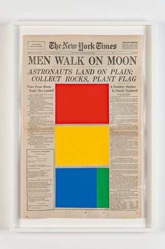
I found that with a lot of Marine Hugonniers work it was the isolation of previously established text which formed the artwork. In this example of a newspaper front page depicting the moon landing the star of the show should be the image of Neil Armstrong stood on the moons surface. Instead the text is all that remains so the viewer is forced to imagine the scenes for themselves to fill in the blanks. In this sense, we are forced to generate a sense of place for ourselves.
In Robert Smithsons ‘A Heap of Language’ in a very basic sense it gives me a sense of place. It visually looks like a hill and when walking in the hills I always find that they make my mind more eloquent…wordy. It vaguely reminds me of the opening sequence of Star Wars (the angle of the text) which in turn takes me back to being in our ratty local cinema. Except when it’s the only cinema you’ve ever been too and the biggest screen you’ve ever seen, it’s more of a palace. If I shut my eyes I can see the pink lights on the walls, smell the popcorn and feel the tackyness on the floor.
9. Guy Moreton
I could not locate any work by this artist that used text and referenced a sense of place. Whilst reading through his bio I did learn about a collaboration project that he carried out with Alec Finlay and Micheal Nedo entitled Ludwig Wittgenstein – There Where You Are Not. It explores landscape and the architecture of landscape, but from what I could see, without text.
An artist that I have heard of! I knew that Blake was famed for being a poet but I had no idea that he also painted, exhibited at the Royal Academy and opened a print shop. I read a lot about his various work and found that he released a series of poems called ‘Songs of Innocence’. It seems that these poems were originally presented with watercolour paintings. I have not been able to locate examples of the two together but I did find the poems themselves online.
I could not find any examples of work by this artist using text which referenced a sense of place.
Caspardavidfriedrich.org. (2019). Caspar David Friedrich – The Complete Works – Biography – caspardavidfriedrich.org. [online] Available at: https://www.caspardavidfriedrich.org/biography.html [Accessed 18 Jul. 2019].
12. John Constable
I could not find any examples of work by this artist using text which referenced a sense of place.
John-constable.org. (2019). John Constable – The Complete Works – Biography – john-constable.org. [online] Available at: https://www.john-constable.org/biography.html [Accessed 18 Jul. 2019].
13. Martin Heidigger
I could not find any examples of work by this artist using text which referenced a sense of place.
I could not find any examples of work by this artist using text which referenced a sense of place although I did find a large catalog of paintings which featured a lot of landscapes.
Nicolaspoussin.org. (2019). Nicolas Poussin – The Complete Works – Biography – nicolaspoussin.org. [online] Available at: http://www.nicolaspoussin.org/biography.html [Accessed 18 Jul. 2019].
15. Dan Graham
I could not find any examples of work by this artist using text which referenced a sense of place.
I wasnt sure which Jane Wilson I was supposed to be looking at so I also checked out the work of the identical twins Jane and Louise Wilson. Again, I could not find any examples of work that included text and referenced Place.
I struggled to find a decent information source for Alexander Maris. From what I can see he is primarily a photographer and does not appear to use text in his work.
Again I struggled to find a good information source for Susan Maris. On one website under ‘biography’ all it said was “Alexander and Susan Maris is an artist” ! There is evidence of photographic work attributed to both the Maris’s but no solo work that I can see, and nothing that uses text.
I found this exercise quite frustrating. Although it was interesting looking at the different artists work and learning some new things, to find that so many of them do not use text initially made me think that I wasn’t reading around enough. After spending a couple of days exploring different sources and satisfying myself that my initial impressions were correct I do not feel that what I have submitted for this research point reflects the amount of time I have put into it.
But, on a positive note, I’ve found some Contemporary Art that I quite like. I’ll be looking at more of Doug Aitkens work at a later date.
This
exercise requires me to read and assimilate the essay on Page 11-26 of the set
book ‘Place. London: Thames and Hudson by Dean, T and Millar, J (2005)’
Reflect on how you found the activity. Is it too
difficult? Do you agree with the authors or not? Has the piece expanded your
understanding of what the word ‘place’ can signify?
I read
the essay which I found too philosophical for my taste, particularly “Place is
all that there is, the limit of all things and in this it might be considered
as a divine being” (Page 14-15).
The activity is not difficult. The most
challenging bit for me was in cutting through the waffle to what the authors
were getting at. I feel sure that I could have put all the same points across a
lot more succinctly with a page of bullet points.
I don’t agree with a lot of the conclusions
drawn by the authors. I do not think that the value of place has been
diminished. I think that it is down to the perception of each individual, if
you have been to a particular location, you know what it feels like, you know
it’s moods. How those make an impression on you will differ to those of the
next person. For example, I see big green hills and think of the rural freedom
that they provide, a town dweller may look at them and imagine only the horrors
of the wind, the rain and the cow pats.
What I mean to say is, somewhere either resonates with you or it doesn’t, there
is no lessening of that.
The only new thing I found within this text
was the description of how the modern concept of landscape has evolved into being.
This was interesting, and I saw the truth in it more on my third/fourth time of
reading than I did on my initial read-through.
“…there
are more concepts of place than actual geographic ones’’ (Dean and Millar,
2005, p12) What does this mean?
My
initial response to this one question perfectly sums up what I’m struggling
with with this section of the module. Although I know exactly what the authors
are getting at with that statement, my initial thoughts were that there are an
awful lot of places in the world and that I doubt they could come up with
enough theoretical notions to beat the list I could make after just ten minutes
with an atlas.
What the
authors are trying to put across is that there are many different uses of the
word place. I’m currently working out of the country, everyday for 2 weeks I
have sat in the same chair at the communal meal time. Initially it was just a
chair, now it’s my place which is left free for me. When I first arrived here
my initial actions were to put my own photos on the wall and to swap the
institutional bedding for some that I brought with me, doing that turned it
from a faceless room into my place. Another example is the feeling of relief
that I have on returning to the UK from working abroad or even holidays.
Although other places are nice, England is where I belong, it is my place.
Place
doesn’t have to be a physical location, it can be a notion or a mindset or even
a memory attached to a set of circumstances which make it relevant to an
individual.