This image is ‘The Cheshire Plain from Beeston Castle’ by Derek Trillo.
This style of image gives a better overview of the environs but no real detail. We cannot tell the height of the objects in the frame or much about the topography of the landscape. Very little human interaction with the landscape can be displayed.
The above link leads to an image of Beeston Castle via the Google Earth satellite. The landscape is completely flat, there is no indication at all of ground features or topography. Terrain types can be guessed at such as fields and woods etc. No human interaction with the landscape can be displayed.
The above image is of Beeston Castle using Google street view. This gives a good indication of the conditions of the immediate area. Some topography is apparent, basic details of the scenery can be seen. This method fails to show overall size of the site, its relation to its environment. It is more likely to be the method used in order to display humans interacting with the site.
When looking at a city there are the opposite problems. It is far easier to show human interaction with the environment than to show the site itself. Particular buildings come to represent an entire town or city because the entire place itself cannot be displayed together in any great detail. A birds eye view of a town would show the entire place but o detail. There would be no way to differentiate between the heights of buildings and the topography that might have affected building choices. A ground level street view is highly limited in what it can display to the viewer. A city scape from a raised elevation is the best way to present a city, it can provide some depth, some detail, and a bit more of a sense of place.
I was then directed to look at the image ‘Agecroft Power Station, Salford’ by John Davies and to make some notes.
The photo being taken from th elevated position gives the image a sense of depth. The juxtaposition of the chimmneys next to the power lines and football match certainly gives a sense of scale!
Taking this shot from ground level would have reduced the sense of grandeur that the chimneys have. It would also have reduced the amount of detail in the image such as the car park in the foreground or the hills in the distance.
Taking the image from closer to the tower would potentially have reduced the available context, as the image is, we can see the tower receding back towards the horizon.
Seeing the football match being played immeadiatley drew me back to the work of Mitch Epstein in American Power.
The above image illustrates exactly what it would look like to take such a shot from nearer ground level. The grandeur of the chimneys is lost as the focus of the viewer is transferred to the foreground interest.
Initially I thought that potentially this change o focus might be because of the vivid colour of the football shirts. To test this I dropped the saturation from Epstiens image and found that the focus it still on the foreground. A slightly elevated viewpoint definetley gives for greater drama!
In this exercise I am to look at the work of Robert Adams and Fay Godwin, note down my responses to them and discuss whether or not this research will influence my own choice of subject in future.
I first looked at the work of Mitch Epstien in American Power. The juxtaposition of elements representing lush countryside and the industrial applications that humans use to damage the planet are easy to see and understand.
The images which clearly show the pollution or steam billowing up from big chimneys into the sky whilst people are engaged in healthy activities around them, raises the question of what the human race is doing to itself as well as the planet.
I fully understand the point that Epstien is making and agree completely. This is not a topic I would choose to explore myself because its all just a little bit depressing. It is a subject that people know needs addressing but they won’t whilst money is still the key factor.
I then looked at the work of Fay Godwin.
Initially I looked at her work ‘Forbidden Land’. The focus here is very much on the idea that people are attempting to restrict access to large areas of natural countryside. There is a focus on the act of fencing off, or privatising the space as opposd to the space itself.
In this image there is a long list of forbidden actions, again displayed on a piece of wood which is dwarfed by the beauty of nature. Who are people to say that you cannot have access to the natural world? In this case walkers on footpaths are still permitted but I have seen plenty where they have had their access denied by landowners with physical obstacles.
I then looked at her later work imagining that it would be the same sort of thing. Instead I found that she seems to have focused on the drama of the English landscape, it’s beauty and complexity as opposed to its relationship with man made structures. There are several images that include man made elements but they seem to support the landscape rather than detract from it. In the image below, though the house is the only man made object within the frame, it does not steal the attention of the viewer. The focus is still on the sky and the wild grasses in the foreground. The house aids with depth in the image whilst not becoming the focus.
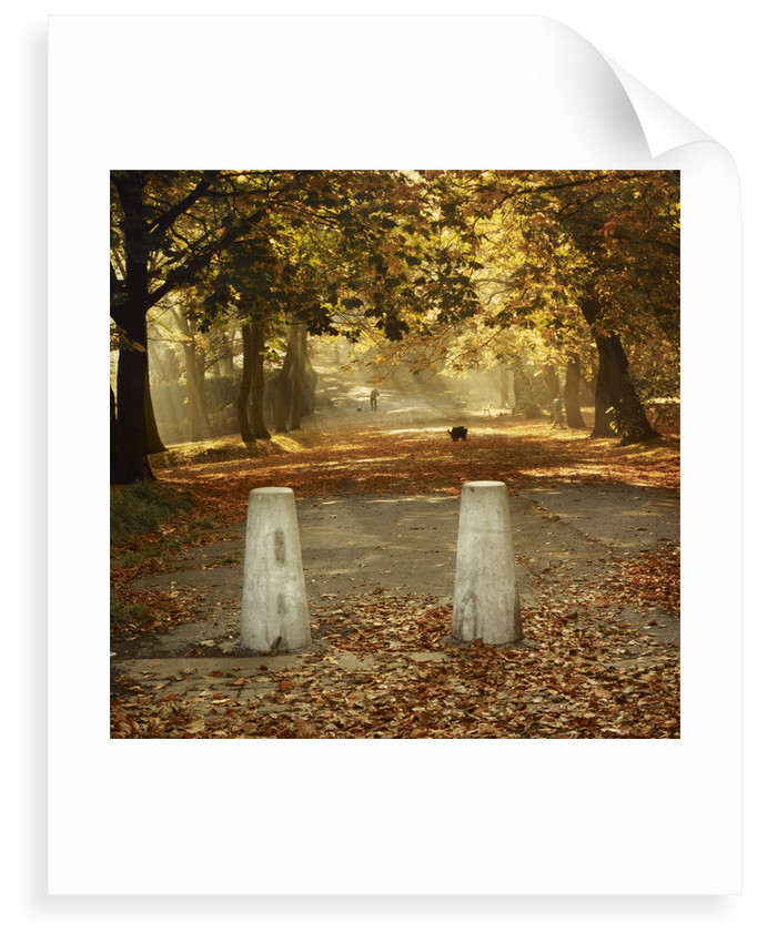
In this image the beauty of the natural landscape beyond is artificially fenced off from the viewer with the concrete bollards. They seem almost unreal in contrast with the stunning colors of the autumnal landscape beyond. The lone animal foraging through the leaves is a point of focus for the eye to travel to on its journey around the frame.
The bollard somehow makes the scene beyond almost unreachable by the viewer, as though we are trapped behind an invisible wall, unable to escape from the urban zone into the countryside beyond.
In this exercise I am to look at two different images of a scene provided to me in the course manual and make some notes on the differences between the two.
The scene is of a town surrounded by countryside.
The first image of the town is a wide angle shot. In the foreground is a closed gate, behind it a field, and beyond that a town. The inclusion of the gate gives a sense of perspective to the image, and scale. The viewer can see the town but also, the far side of it, and the hills beyond. The viewer can take a proper gauge of the location of the town and the kind of environment that it is situated within.
The second image is of the same town but through a telephoto zoom lens. The majority of the fore/middle ground is covered by buildings, in the far distance is a patch of hillside and then just sky. With this second image there is no real sense of place, just large amounts of people. This image feels more accessible because there is no physical obstruction to the viewer (the gate in the first image), but there is also nowhere to travel. The viewer can delve into the detail of the image and explore the different dwellings and roadways, yet cannot escape the town itself.
I could only listen to half of this curators talk on the subject of Richard Longs work. I could only do half because enduring listening to the highbrow philosophical activities that some people class as art was making me wish I could headbutt a wall. I guess art is always intended to provoke a reaction, mine is that of aggravation.
In my opinion – Walking is not art. Picking up a stone, throwing it, following it, and repeating this process around ‘a mountain’ does not make you an artist, it makes you a colossal tit. As for cutting a circle in your neighbours lawn and giving it a title?! This was ‘created’ in the 60’s so I can only assume that he was absolutely off his face on some kind of hallucinogenic. Obviously the art world recognises this as some kind of higher thinking otherwise the Tate wouldn’t have brought the photograph. Part One of this module made me fully aware that I think Contemporary Art is absolute twaddle, listening to this lecture just confirmed it.
I’m hoping the point of listening to this lecture is to introduce the point about using photography to record these exhibits and whether this photograph then becomes an artwork in itself. I would say no, it is a record of the artwork because it is a picture of a ‘thing’. When a photograph becomes an artwork is when that image records something in its raw state, something which requires the medium of photography to allow it to take form.
In an effort to try and make this vaguely more level headed I can only refer back to my initial definition of what art is from back in Part 1.
What is art? – In my opinion, art in general is anything which draws you in, absorbs you, makes you want to keep studying it. For example the beauty in a sunset is a sensation of nature, the photograph or painting which can capture that sight, that is art.
After much consideration, even with my newly broadened horizons post-Part 1, I cannot say that Richard Long passes my own art definition, but I’m sure he’s idolised by many many other people!
I feel like I haven’t done enough in Assignment Three. Looking at the questions the course manual has instructed me to cover I think that I have covered them all, and am approximately on the word count….but it still feels like a sandwich without any filling.
I quite enjoyed this exercise which made a nice change! It was interesting to learn about Monets work and circumstances, it made entertaining reading. I particularly liked learning about his single minded nature. I’d summarise it as, ‘I will build a water garden right there with these plants and paint it repeatedly and in a style that no-one else really likes if I want too’, which made me chuckle quite a lot.
I am also constantly surprised (probably shouldn’t be by now) oat the talent displayed in so many different disciplines by Banksy. That artist has got some mad talent.
So, in essence, I ‘think’ I have done ok with this one….but wont be surprised if there is a lot of reworking to carry out!
What, in your view, makes photographs unique as an art form?
Photographs are unique as an art
form because of the person behind the camera. As much as one person will draw
an apple differently to another, one person will photograph a scene or object
differently again. Photographs are the photographers representation of a moment
of reality, a moment which will likely never be repeated. Emotions and messages
can be conveyed through photographs, mood and tone. Photographers paint with
light the same way that painters do, the only difference is, in some form, the
subject in their images is real and recognisable.
In terms of the form of a
photograph there is no difference between an image displayed ona digital screen or presented as a hard copy.
Digital images are adjustable but if you do that, it has become a different
photograph. A photograph does not have to be permanaently fixed, a film is just
a lot of individual photographs moving incredibly quickl, freezeframes.
My task in this Assignment is to identify an example of visual re appropriation within visual communication and analyse it in comparison to its original.
Following Tutor Feedback I redrafted this essay to contain a lot of the vital points which I had completely missed! These were; my reasons for choosing the Banksy, a lack of quotes to support my arguments, unqualified statements and the arguments for and against graffiti.
I have kept the original essay to make it easier for assessors to see where I have made changes, it is below this edited version and the references.
I chose to use a piece called ‘Show me the Monet’ by Banksy which I think will be a good fit for this exercise. I chose it because of the clear way in which Banksy has re appropriated a classic work to give a distinct message about consumerism, to my mind it meets the brief perfectly. In addition, I like both artists work so that didn’t hurt either! I think Monets green colour palette is very positive and calming whilst Banksys joyful approach to communicating his message always makes me laugh. It is the humour of his approach and the incredible skill levels of his work which I adore.
It is interesting that whilst most graffiti artists work is frowned upon and painted over, Banksys are sought after and can sell for millions. As with any artist there are those that hate his work and destroy it on sight, whilst others seek to protect it and give it recognition.
In my opinion, graffiti art needs more recognition. Within this genre though I would make a clear distinction between those who are actually making art and those who are just spraying their name on a wall. There are lots of excellent artists but what I believe sets Banksy apart are his political messages on current events. The humorous take on serious events combined with his excellent craft puts him in a league of his own.
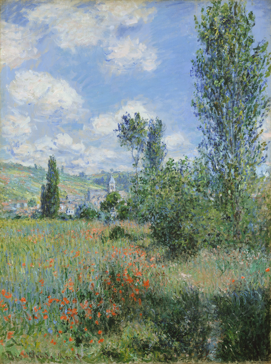
Looking at the denotation of Monets original, I see a bridge suspended over a pond. The pond contains a variety of water lilies and is framed on the right by rushes and at the back by green trees. The suspended bridge acts as a top framing element to further focus the viewers eye on the lilies below.
When I consider the connotation of this image I keep returning to these lilies. I think this image is a celebration of the pond and its plants, I can not spot a deeper meaning to the image than this.
On researching a little I discovered that Monet was a passionate horticulturalist who brought some land near his house with the intention of building something ‘for the pleasure of the eye and for motifs to paint’. He first noticed the land when he was travelling through the village of Giverny on the train. He created his water lilies garden importing the plants from Egypt and South America despite the demands of the local council that he destroy them. In 1899 he began a series of paintings of it from different angles. Of the 18 paintings this is the one which I have seen most often displayed. (..I think…a lot of them are quite similar!)
He spent the last 30 years of his life painting his water garden even when he started to lose his sight to cataracts in 1912. After his death in 1926 the Lilies series remained in his Givency studio. It was 1955 before the Museum of Modern Art purchased their first image of the Lilies and it soon became their most well known attraction.
There are conflicting opinions on whether Monets series of lily paintings did or did not attract good press. According to Mentalfloss.com critics at the time argued that the impressionist style paintings were messy and blurred, however the webpage does not give further information on who these critics were. It was implied that this was because of the artists failing eyesight than a reflection of his painting style. Looking at an article from The Telegraph by Alastair Sooke in contrast it refers to Monet as the ‘prince of the Impressionists’ and a ‘figure of national importance’. These are not words I would associate with an artist who was being spurned.
Monets series of paintings is on display at various museums around the world. The painting ‘Bridge Over A Pond of Water Lilies’ is on display in The Met, Fith Avenue, New York City. I personally accessed it online and have never seen it in person. The nearest I have come to seeing a physical version of it is in Primary School when a teacher showed us a poster of a portion of one of the images of lilies. The invention of the Internet and its adoption by most people has opened up the world massively. I would never be so drawn to go and see Monets work that I would save for the years it would take to accumulate enough for the airfare to go and visit The Met in person. If the collection were to go on tour I doubt I would be able to get the correct day off work to go and see the exhibition when it reached the UK. But thanks to the Internet I can satisfy my curiosity and have a good look from the comfort of my own home. Because of the accessibility of art through the Internet, works can be seen and enjoyed by more people and therefore referenced in pop culture (as Banksy has done) to make a point which is understood.
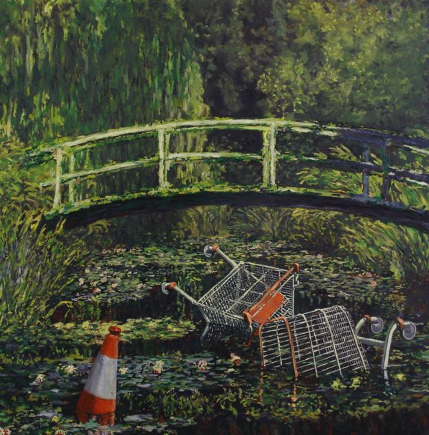
The Banksy re-interpretation ‘Show Me The Monet’ shows the same scene of a bridge suspended over a pond full of water lilies. In this case though, the pond also features two discarded shopping trolleys and a traffic cone.
The images title ‘Show me the Monet’ can be interpreted in different ways. Banksy is a street artist known for creating art in public spaces where it can be widely viewed. He has frequently illicitly inserted his own versions of artwork into galleries but remains a prominently outdoor artist. In this sense, the title could be a reference to the fact that famous works are brought and kept by individual institutions. The additions of the trolleys and their symbolic reference to consumerism could be a more literal reference to money, an available play on words for Monet. Whichever it is, the more I look at different works by Banksy the more I notice that under his showman style of presentation he is a very intelligent artist with some very good points.
The shopping trolleys represent consumerism and the damage it is doing to nature. People are so obsessed with material gain that they disregard the fact they are killing the planet. I could not find reference to the initial showing of Show Me The Monet however I know that several of Banksys reimaginings of classical art were subversively planted in real gallerys such as the Louvre. I hope that this was one of them! I think this message that he wants to give with the art is fairly obvious.
Banksys work doesn’t just reference Monets original, it highlights its beauty in a whole new way. There are many images of beautiful landscapes but very few in which we can so directly see the negative effects that humans and our consumer society have on the planet. By using the same scene with the same component parts Banksys trolleys enhance the beauty of Monets waterscape with their sheer ugliness.
When Monet was alive and painting, people would produce paintings to raise awareness of beautiful things, to celebrate and document them. Banksys art is usually a social or political comment on a current situation. Where Monet would want to share the beauty of a particular scene, Banks wants us to realise how we are destroying them. Monets work is sought after and presented in galleries, Banksy sneaks into galleries and inserts his work (framed) for us to stumble across. Both artists are trying to make us aware of the same thing, beautiful places. It is just such a shame that people seem as determined to ignore it and not take action now in 2019 as they were back in 1899.
I think that using the same medium and style as Monet makes Banksys message even more striking. Famed for stencil art he could have easily made a stencil representation of this scene to illustrate the same message. In my opinion this would not have been so effective. By using the traditional painting of the original and incorporating the modern elements there is an added emphasis on the juxtaposed content.
There are several messages about consumerism here. There is the obvious message about peoples consumption without consideration, there is the irony of making that point by re appropriating an image that sells for $43M, and the further irony that anything Banksy touches also sells for vast sums. There are the further thoughts that it costs money to clean up our natural environment, and to do it voluntarily people need an incentive, often financial. The common message running through all these themes can be summed up wonderfully with Banksys title, to so many different people on so many levels ‘Show me the Monet!’.
Looking at the denotation of Monets original, I see a bridge suspended over a pond. The pond contains a variety of water lilies and is framed on the right by rushes and at the back by green trees. The suspended bridge acts as a top framing element to further focus the viewers eye on the lilies below.
When I consider the connotation of this image I keep returning to these lilies. I think this image is a celebration of the pond and its plants, I can not spot a deeper meaning to the image than this.
On researching a little I discovered that Monet was a passionate horticulturalist who brought some land near his house with the intention of building something ‘for the pleasure of the eye and for motifs to paint’. He first noticed the land when he was travelling through the village of Giverny on the train. He created his water lilies garden importing the plants from Egypt and South America despite the demands of the local council that he destroy them. In 1899 he began a series of paintings of it from different angles. Of the 18 paintings this is the one which I have seen most often displayed. (..I think…a lot of them are quite similar!)
He spent the last 30 years of his life painting his water garden even when he started to lose his sight to cataracts in 1912. After his death in 1926 the Lilies series remained in his Givency studio. It was 1955 before the Museum of Modern Art purchased their first image of the Lilies and it soon became their most well known attraction.
Originally Monets series of lily paintings did not attract good press. Critics at the time argued that the impressionist style paintings were messy and blurred. It was implied that this was because of the artists failing eyesight than a reflection of his painting style.
Monets series of paintings is on display at various museums around the world. The painting ‘Bridge Over A Pond of Water Lilies’ is on display in The Met, Fith Avenue, New York City. I personally accessed it online and have never seen it in person. The nearest I have come to seeing a physical version of it is in Primary School when a teacher showed us a poster of a portion of one of the images of lilies. The invention of the Internet and its adoption by most people has opened up the world massively. I would never be so drawn to go and see Monets work that I would save for the years it would take to accumulate enough for the airfare to go and visit The Met in person. If the collection were to go on tour I doubt I would be able to get the correct day off work to go and see the exhibition when it reached the UK. But thanks to the Internet I can satisfy my curiosity and have a good look from the comfort of my own home. Because of the accessibility of art through the Internet, works can be seen and enjoyed by more people and therefore referenced in pop culture (as Banksy has done) to make a point which is understood.
The Banksy re-interpretation ‘Show Me The Monet’ shows the same scene of a bridge suspended over a pond full of water lilies. In this case though, the pond also features two discarded shopping trolleys and a traffic cone.
The images title ‘Show me the Monet’ can be interpreted in different ways. Banksy is a street artist known for creating art in public spaces where it can be widely viewed. He has frequently illicitly inserted his own versions of artwork into galleries but remains a prominently outdoor artist. In this sense, the title could be a reference to the fact that famous works are brought and kept by individual institutions. The additions of the trolleys and their symbolic reference to consumerism could be a more literal reference to money, an available play on words for Monet. Whichever it is, the more I look at different works by Banksy the more I notice that under his showman style of presentation he is a very intelligent artist with some very good points.
The shopping trolleys represent consumerism and the damage it is doing to nature. People are so obsessed with material gain that they disregard the fact they are killing the planet. I could not find reference to the initial showing of Show Me The Monet however I know that several of Banksys reimaginings of classical art were subversively planted in real gallerys such as the Louvre. I hope that this was one of them! I think this message that he wants to give with the art is fairly obvious.
Banksys work doesn’t just reference Monets original, it highlights its beauty in a whole new way. There are many images of beautiful landscapes but very few in which we can so directly see the negative effects that humans and our consumer society have on the planet. By using the same scene with the same component parts Banksys trolleys enhance the beauty of Monets waterscape with their sheer ugliness.
When Monet was alive and painting, people would produce paintings to raise awareness of beautiful things, to celebrate and document them. Banksys art is usually a social or political comment on a current situation. Where Monet would want to share the beauty of a particular scene, Banks wants us to realise how we are destroying them. Monets work is sought after and presented in galleries, Banksy sneaks into galleries and inserts his work (framed) for us to stumble across. Both artists are trying to make us aware of the same thing, beautiful places. It is just such a shame that people seem as determined to ignore it and not take action now in 2019 as they were back in 1899.
I think that using the same medium and style as Monet makes Banksys message even more striking. Famed for stencil art he could have easily made a stencil representation of this scene to illustrate the same message. In my opinion this would not have been so effective. By using the traditional painting of the original and incorporating the modern elements there is an added emphasis on the juxtaposed content.
500 Word Commentaryabout Part Three
My main stoppers during this part of the course have been the trials and tribulations of my day job. During Part Three I’ve had to move to a new part of the country, rip out a kitchen and learn a new role so my study time has been even more disjointed than usual!
In terms of Part Three itself, the projects which most engaged my interest were Re-contextualizing Images, Mixed Messages and the Assignment itself. Im interested in the Graphic Design behind film and TV, so anything to do with fonts and typography I find interesting. I have always been interested in Photography (and Adobe Photoshop) so rearranging images in the Re-Contextualising Images exercise was a pleasure, especially with Boris Johnson as my main character, he is just so expressive! The Assignment was the most enjoyable of the lot. I always enjoy looking at Banksys work but too my surprise the more I looked into the work of Monets water lily project the more interested I became! This was due to the character of the artist and how his rebellious nature was described. I tend to imagine classic artists as being law abiding left wingers, not illegal plant smuggling border line obsessives! I was quite entertained! I’ve also started to gain a lot more interest in the original works of these art world Greats. Following tutor feedback I returned to this essay and looked at a lot more sources, some of Monets work really was breathtaking. One which particularly caught my eye was this View of Vetheuil. I like it because when displayed small on my browser window it looked almost photographic, then when I enlarged it, the full Impressionist approach revealed itself…I might even get a copy for my wall….
The exercise which I enjoyed the least was the very first one, ‘Identifying Visual Communications’. I fully understand and appreciate why it is required. It forces us to really get an understanding for the different types of visual communication and how it is everywhere. What grates on me is the length of if time-wise and having to prove every step with the image sourcing and referencing and then attempting to write notes on each image. This is consistently identified as one of my weaknesses and I fully concur. I know why I have to do it…I’m only bringing up this negative point because the course manual is asking me!
The manual also asks me if I am inspired to do further visual communications courses, I absolutely am. I continue to wish to complete this degree with Illustration and Graphic Design because I feel that they complement each other well. My ongoing overall inspiration are the Graphic Designers Eduardo Lima and Miraphora Mina who are the creative team behind the art of the Harry Potter/Fantastic Beasts franchises.
In this exercise I am to explore a range of websites or other forms of new media and identify examples of what I consider to be cutting edge or inventive forms of visual communication.
Theyre not exactly cutting edge, they’ve been around for a few years now, but my first thoughts are Facetime, Twitter and Instagram.
Facetime – I’m only 33, yet in my lifetime I’ve known the world with no internet access and with no mobile phones in sight. Because of that I can appreciate quite how good it is to be able to video chat across thousands of miles with absolute ease. Video tech is probably classed as old hat by now but the changes it has enabled are astounding.
Twitter – Less for the visual use and more for sharing thoughts or ideas, Twitter is a handy tool for being able to get direct access to the thoughts and messages of people you admire.
Instagram – Free photo sharing platform for everyone with an internet connection. Excellent way to share photos around the globe. The search facility allows you to find photographs on anything you can think of.
Emoticons – With the evolution of text messages and smiley faces made from punctuation marks, emoticons have emerged as a new form of punctuation. In some instances they add feeling/body lannguage to a text message which could otherwise be taken out of context.
Text and emoticons can also be used badly, things can evolve too far. For example, it is now deemed officially (within the military at least)rude to end a message ‘Regards’, to be polite one must say ‘Kind Regards’. Ridiculous.
Another example of how it can be used badly is when generational rules become the norm, for example in the news recently they announced that using a full stop in a text message was deemed to be angry. A full stop is a basic item of punctuation, that’s all. People are allowed to go too far with their left wing pink and fluffy approach to everything.
In this exercise I am to find examples of different visual conventions used to convey time and/or place/space – frame by frame storytelling, handling or perspective, use of speech bubbles etc from different historical periods. I am to use this research exercise to develop by skills by accessing the online image libraries available to me at the OCA, conducting internet image searches or accessing my local library.
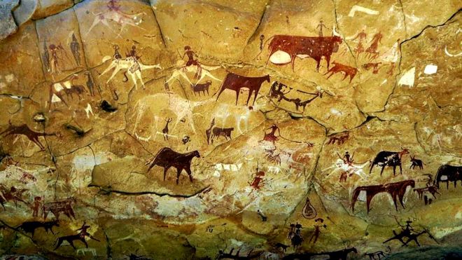
Cave Painting
Every book of art starts with a cave painting. Cave paintings are the earliest records of events that we have found so far.
Within this painting there is a strong sense of place. Mountain ranges have been depicted and with the, animals being hunted by man. The scene even includes a campfire scene in the bottom right hand third. Time is shown by the limited use of resources that they had to paint with. Place is depicted within the scene. At this time there would have been little comprehension of the wider world.
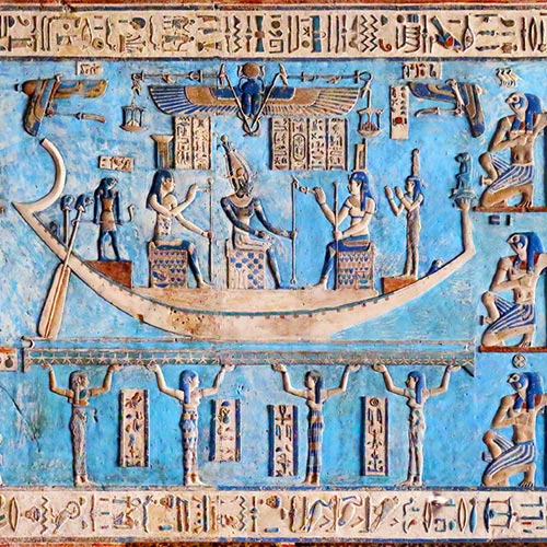
Heiroglyphs
First Light Porta Alchémica®. (2019). The Magical Art of Storytelling : First Light Porta Alchémica®. [online] Available at: https://www.portaalchemica.com/storytelling [Accessed 26 Aug. 2019].
Storytelling in Egypt was of massive importance. I found a great quote on http://www.portaalchemica.com which sums it up perfectly ‘ They wove complex cosmological knowledge into narratives that expressed both physical and metaphysical concepts. Those who told the stories, the storytellers, were known to be maa kheru – true of voice.’ The stories that they told often related the lives of common people directly to the Gods and Goddesses, especially with the Pharoahs who came to be deemed as Gods themselves.
In all the examples that I found, the Egyptian stories were all told within one frame. There were no obviously sequential images.
Time is depicted through dress, it may also be written in the heiroglyphs?
This painting entitled Bacchus and Ariadne by Italian artist Titian is an example of the kind of storytelling that used to take place in one frame during the renaissance period.
Within this image we have Ariande on the left hand side, she has been left deserted on an island by Theseus who was her lover. His ship can just be seen in the far distance as it sails away. Bacchus is a god of the grape harvest, he is the figure in the purple robe who has just turned up in a chariot drawn by cheetahs. He saves her from her fate on the island, and, the website tells me, marries her and grants her immortality.
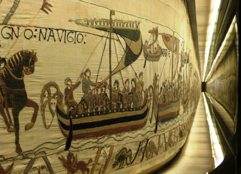
The Bayeux Tapestry is the earliest example I can think of of an image depicting sequential action. This 68 meter long tapestry contains 75 scenes with Latin descriptions which range from the build up to the Norman invasion of England right up until the Battle of Normandy itself.
Commissioned to retell the story of a historical event, the time of the scene is set forever as 1066. The place is also dictated by the subject matter but reinforced with the pictorial representation of French boats and national armour styles etc.
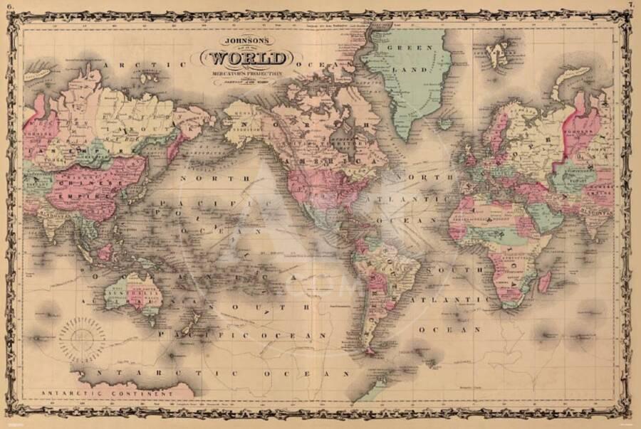
Maps of different varieties are another visual convention used to display space or place. Different sorts can change with time, for example the British Empire used to be displayed in pink on world maps. Another example would be that as we lose coastlines and eventually islands though erosion via the global warming crisis, maps will have to be redrawn.
Film storyboards are sequential images designed to help film crew manage the time of the shoot and to ensure that timings within the fictitious story stay true to the plan. In these ways they are essential for conveying a sense of time. Storyboards can also be used as scene setters, to introduce and cement a sense of place for an audience.
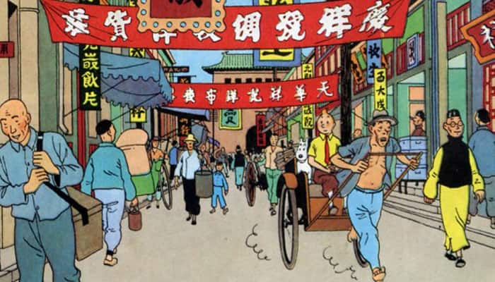
Cartoon Strip
Tintin was always a favourite of mine when I was small. I remembered that he was always trotting around the globe so thought that he would make a perfect subject for the Cartoon Strip entry into this research exercise.
This frame, set in China, demonstrates how easily a sense of place can be set. The banners and signs in the street have oriental writing on, the three faces nearest the viewer look obviously un-English and people are wearing oriental costume. Its very easy to generate a sense of location.
This sequential cartoon strip demonstrates how action and location can be put across through a series of frames. The use of speech bubbles mainly follows the left-right placement which the viewers eye is naturally programmed to follow. Occasionally the speech bubbles are positioned to enhance the idea that dynamic movement is taking place.
This political cartoon sets both time, an approximate place and also refernces popular culture. The time is set with the word ‘Brexit’ and Theresa May painting the tunnel, this gives us a definite time frame. The Brexit tunnel itself looks suspiciously like the Channel Tunnel, our link to Europe. The form of the coyote references Road Runner and how the Wily Coyote is always trying to catch the road runner.
Short animated sequences can be used as scene setters for time and place very effectively. This intro to the series Dads Army manages to communicate in under a minute that we are set during World War Two, Dunkirk has happened, English forces are regrouping back on the mainland. This is all accomplished through very basic graphics.
In this exercise I am to examine knitting. I am first to create a mind map (1) of what knitting means to me and what I associate with it. I am then to do some visual research (2) by finding contemporary and historical examples of knitting being represented. I am then to see how the examples of knitting that I’ve found support or contradict the associations identified in my mind map (3). I am then to see if there is a general stereotype of knitting and how have contemporary images of knitting played with this stereotype (4).
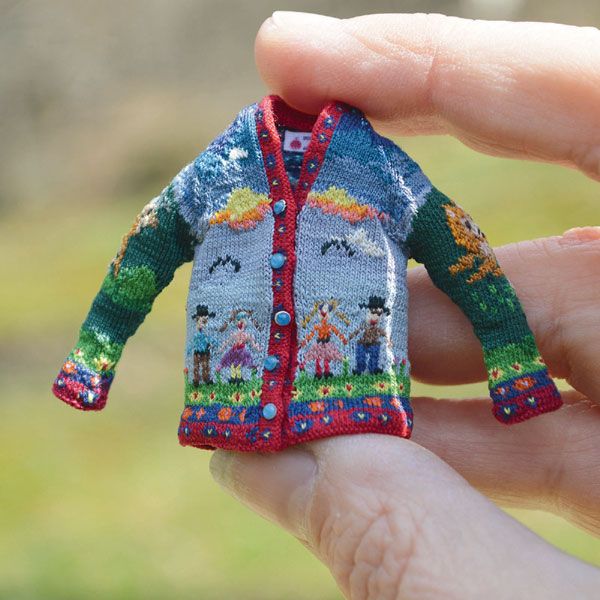
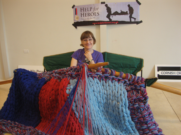
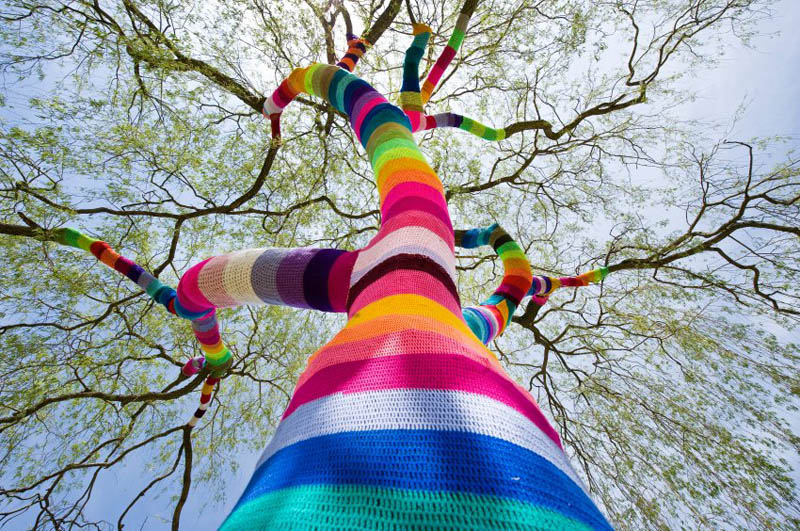
Mind Map I first brainstormed everything I could think of to do with knitting. I immediatly came up with the stereotype of old ladies sitting around knitting and churning out scarves, gloves, jumpers etc. I then thought of different types of knitter that I had seen. A Scouse friend of mine used to bring her knitting into work and do it during tea breaks when she was feeling stressed (the needles were a blur and she would swear profusely the entire time but she always felt better afterwards), a lady on Dragons Den submitted a pitch for giant yarn and giant knitting needles. Last year I went to Bowood House craft fair (Kirsty Allsop event) and there were knitted covers on lamp shades, lamp posts and everything inbetween. I guessed that there might be cases of extrmee knitting and sure enough I discovered both the incredibly small and the oversized. This soon morphed into (2) find contemporary and historic examples.
What is yarnbombing? ” the action or activity of covering objects or structures in public places with decorative knitted or crotcheted material, as a form of street art”
( Dictionary.com. (2019). Dictionary.com Is The World’s Favorite Online Dictionary. [online] Available at: https://www.dictionary.com/ [Accessed 26 Aug. 2019].)
Knitting as street art?! Surely not!…….but how wrong I was…
Ive always thought of knitting as a womens activity as traditionally we have been the ones to stay at home. I’ve found a picture reference which backed up that point and made me laugh quite a lot. It doesnt get any more ‘female in the home’ than Mary the mother of Jesus pictured knitting in a painting created in the 1350’s.
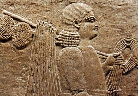
I initially started looking for the earliest trace of knitting. Every book or art starts with a cave painting of something and sure enough I found a photo of what looks like knitting in an Egyptian looking stone carving. I was quite excited to read more about this on the website I discovered it on, unfortunately though they do not seem to know anything about the picture themselves, it isn’t mentioned at all in the text. I’ve included it as a point of interest.
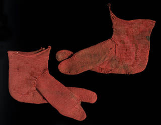
This is the Vand A’s earliest example of knitting. It is a pair of socks from Egypt dating from around the 3rd to 5th century AD.
Knitting was recognised and protected as a trade in England from an early age. In 1571 the cappers act was past which enforced the wearing of caps for most common people on every Sunday and holiday “a Cap of Wool knit, thicked and dressed in England, made within this Realm, and only dressed and finished by some of the Trade of Cappers, upon pain to forfeit for every Day of not wearing three Shillings four Pence”
In the 18th century knitting became a pasttime of wealthy ladies who had the hours to spend learning to knit properly. It soon became a ladies ‘skill’ such as singing and playing the piano. The creation of fancy items became a widely accepted way of demonstrating ones taste and skill level.
As knitting became more well known it was adopted by sailors and fishermen as a way of creating garments to keep themselves warm, around this time the cable stitch was developed which added bulk and warmth to the items.
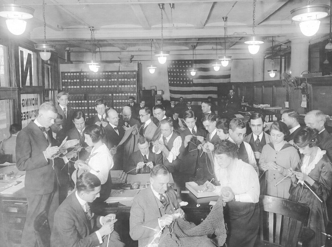
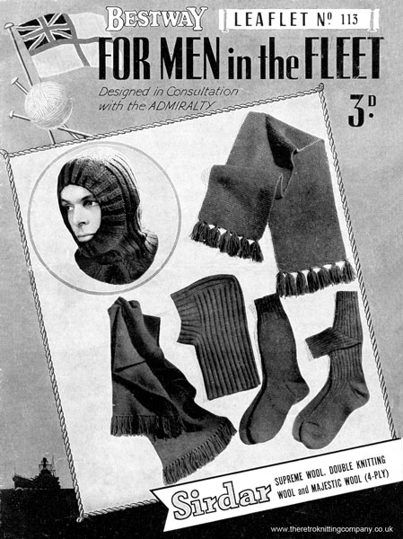
In the First World War people were encouraged to knit items to keep the soldiers in the trenches warm. Again in the second world war with wool in short supply people were encouraged to recycle with knitting, picking apart old jumpers to make new ones.
3. Looking at the stereotypes which I came up with from my initial mind map and the actual history of knitting, they are worlds apart. Whereas I was under the impression that knitting was something that only old people did when they were less mobile and had more time on their hands, it is in fact something that people have done for thousands of years. Its an economical way to generate clothing and provide garments with added warmth to those who may need them. I particularly enjoyed learning about how during World War Two people used to unpick old jumpers to recycle the wool and knit new ones. Everything I have learnt in my research absolutely contradicts the associations identified in my mind map.
4. There is definitely a general stereotype of knitting as being associated with old people. I think this is because those who are in their 60’s now were probably the last generation to use knitting as a necessity. I have parents in their 60s and they both have tales of knitted swimming costumes. Thanks to the internet and a new interest in all things craft, knitting is becoming more well known again. New interest in it as a hobby is awakening. I think that if the same question were to be asked in another 10-15 years the answer would be that Knitting is something craft loving people do. I for one hope that it will be around for a long time to come.


